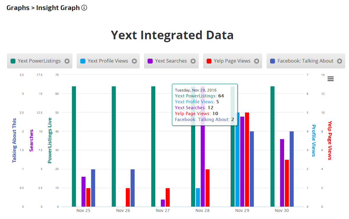
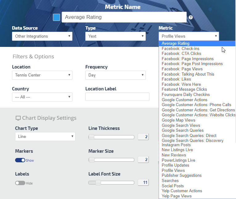
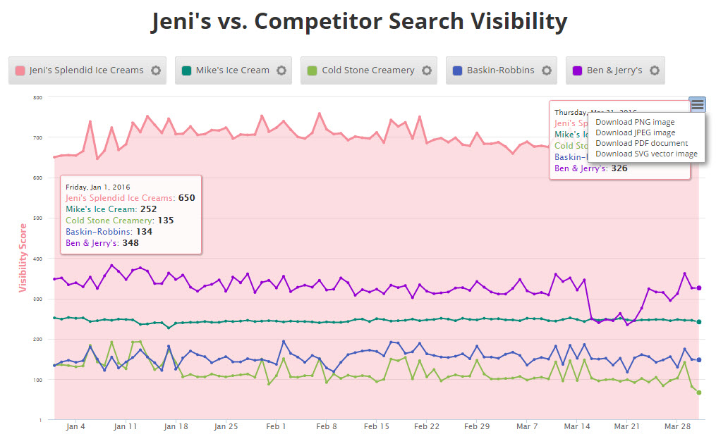
The Insight Graph gives you the freedom to create graphs with blended metrics, date ranges, chart types, etc. choosing from our rank data and a variety of third-party integrations.
Compare results to the previous period, same time last year or select your own custom date range, and view with your choice of Main or Secondary Axis options.
Color Palette and Display Settings let you create a custom graph design.
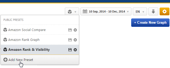
When you're finished creating a graph, save a personalized version and then create additional versions using different metrics, variables, and styles of that graph for the same campaign using our Preset feature. Export your creation to a variety of image types or PDF, or add it directly to an existing Marketing Dashboard or scheduled White Label PDF Report.
Example of Insight Graph in Marketing Dashboard
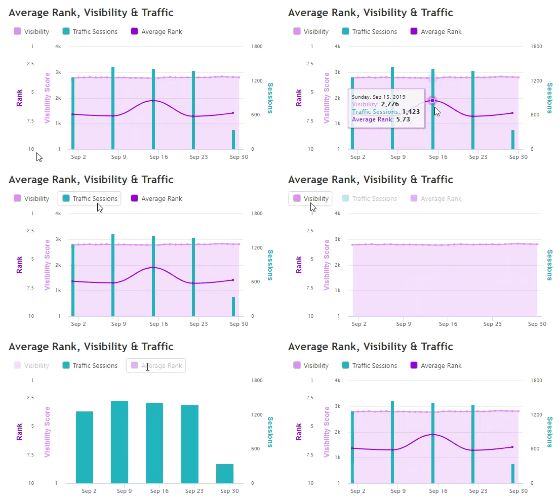
Clicking on a metric in the legend switches from display to hide in the graph
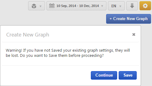
Create New Graph
The first time you navigate to Reports > Graphs > Insight Graph for a campaign, you'll see a blank canvas waiting for you to create and customize your first graph.
Three categories of metrics are available in the Insight Graph, click one to begin creating your graph:
Campaign Metric: this allows data only from the campaign it is being created in
Cross Campaign Metric(Enterprise only feature): this allows data from any account campaign
Custom View Metric: this allows data from multiple campaigns to be aggregated (learn more...)
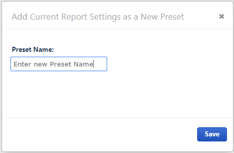
Once you've created a graph for a campaign you can save it as a Preset for future use, and also for use in other campaigns by selecting the Account-Wide option. When you've saved multiple Presets, you can easily switch between them without the need for changing graph settings (refer to Report Presets instructions).
After creating a graph in a campaign, if you'd like to create another for the same campaign, click the Remove All Metrics button.
Save Current Graph or Continue
If you haven't already saved the graph that you currently have on the screen and would like to, click the Save button and follow the Save a Graph Preset instructions.
If the graph was already saved, or if you don't want to save changes you've made, then click the Continue button.
Report Options
Custom Date Range
Date:
Select:
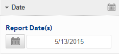
Report Dates from the Report Options calendar
tool; or
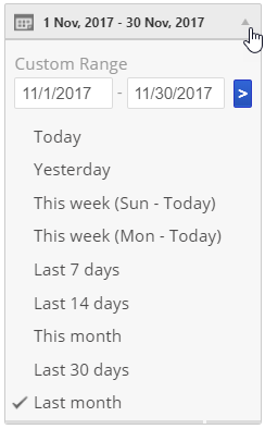
a Custom Date Range in the top right toolbar
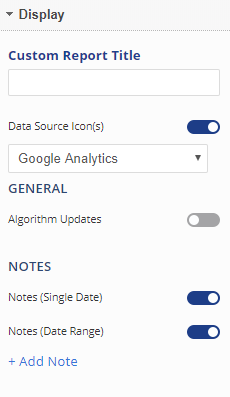
Display Settings:
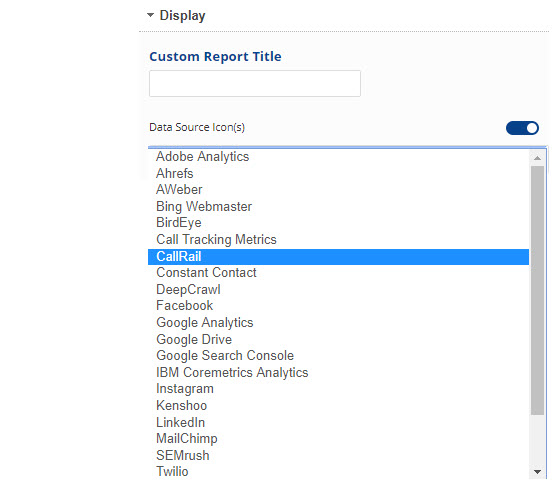
Enter a Custom Report Title to display at the top of your graph (optional)
Show or Hide Data Source Icon(s): if set to display, select the data source
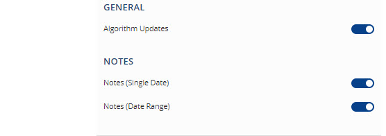
Show or Hide the Algorithm Updates recorded by our Rank Risk Index
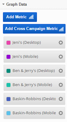
Click the Add Metric button to create a new metric. Refer to Add Metric, Metric Settings, Display Settings, and Date Settings sections below for a description of the many available options.
Click the gear icon of any existing metric to change its settings
Drag and drop metrics to reorder their display in the graph
More Metrics can also be added to the graph by clicking the Add Metric button after you have clicked the Report Options Apply Changes button, refer to the Add Metric section below for more information.
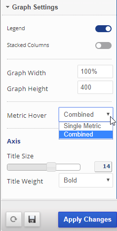
Graph Settings:
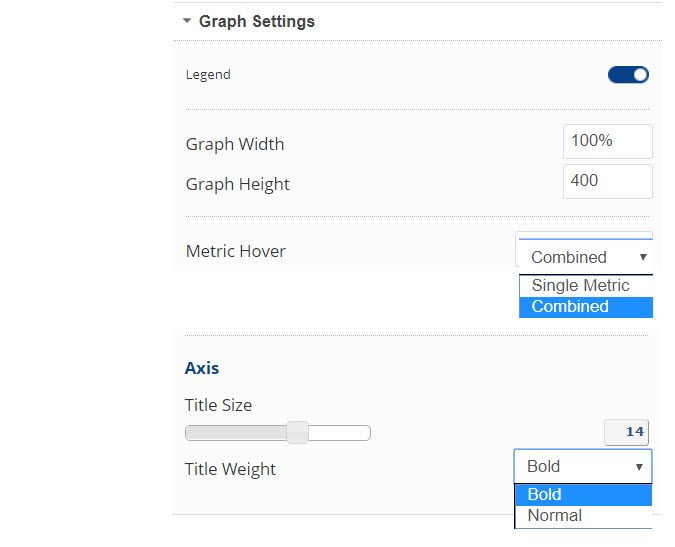
Show or Hide the Legend
Show or Hide Stacked Columns: graph metrics must be Column chart type and created before selecting this option
Enter the Graph Width (in pixels or percent) or keep our default setting
Enter the Graph Height (in pixels) or keep our default setting
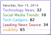
Select Combined or Single MetricHover; Combined displays data of all graph metrics for the point on the graph that you hover over, and Single displays only hover point data for the single metric. Combined Single
Slide to select Axis Title Font Size
Select Bold or Normal Axis Title Font Weight
Save:
Click the Apply Changes button
Refer to Report Default Settings for more information about default setting features and uses.
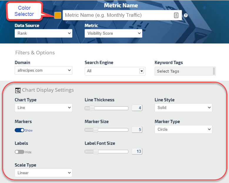
Metric Display Settings
Display Setting Options
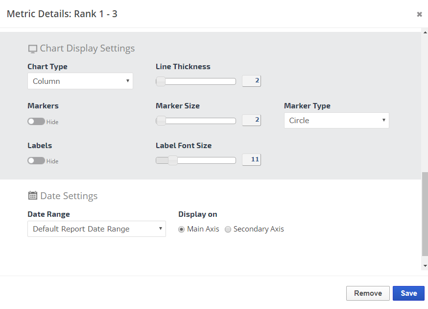
Select color, chart type, line thickness, Show or Hide markers and labels and customize type and size.
Color Selector
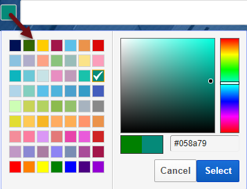
Click the color box to the left of the Display Settings title to launch the Color Selector. Choose a color for the display of the selected metric on the graph. Options include:
select a standard color from the palette
slide the color bar and drag the dot until the color you want is displayed
enter a Hex color value
Then click the Select button
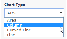
Chart Type
Depending upon the selected metric, you may choose from Line, Curved Line, Column, or Area chart types.
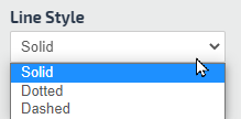
Line Style
Depending upon the selected chart type (line or curved line), you may choose from Solid, Dotted, or Dashed line style.
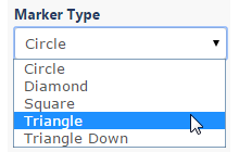
Marker Type
Select from Circle, Diamond, Square, Triangle, or Triangle pointing down for data point marker type.
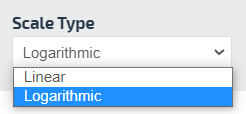
Scale Type
Select from Linear or Logarithmic to change the scale of the metric displayed.
Linear is for the data that doesn't differ much from each other. However, it is recommended to use Logarithmic for the data that has a very big difference between the two or more metric data. For example, one metric data values are in thousands while the second is less than 10.
If the metric type for two or more data is the same, then use the same Scale Type. If in this case there is a big difference in metric data set both Scale Types to Logarithmic. For the two or more different metric types use the logarithmic scale only for the metric type that has a high metric data value.
Date Settings for Custom Time Period Comparison
Comparative Date Setting Options
No changes are needed in this section if you want to use the Default Report Date Range and one axis.
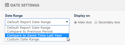
If you want the metric to compare to another graph metric using a different time period, select from:
Compare to the Previous Period
Compare to Same Time Last Year
Custom Date Range
If you want that comparative data to display on its own date axis, then select Secondary Axis
Click the Save button
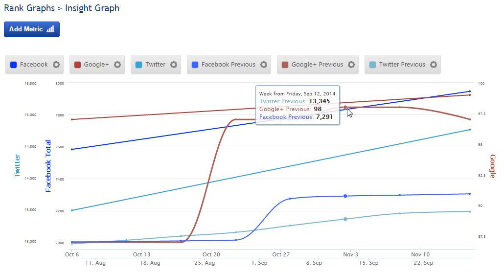
Example of Comparison to Previous Period using Secondary Axis
Average Rank Insight Graph
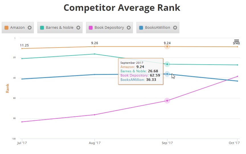
Trending competitor average rank is one of the many ways you can use the average rank metric in Insight Graphs.
Average Rank Options
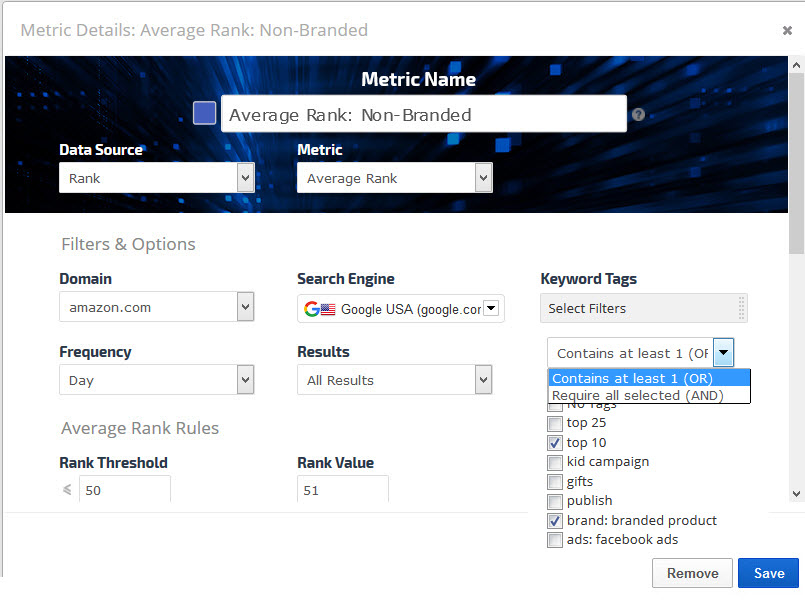
Average Rank is the average rank of all campaign keywords combined for the selected time period. When you select the Average Rank Metric Type, you have a variety of options and filters to utilize for customizing your Insight Graph.
Metric Name
Enter the name that you want displayed as the legend label
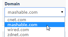
Domain
Select from the list of domains being tracked for the campaign
Search Engine
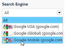
Select a Search Engine
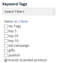
Keyword Tags
Select the keyword tags you want to filter rank data by for display in the graph
Frequency
Display rank data by Day, Week or Month
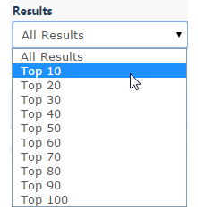
Results
Select all Rank results or filter Rank results by Top 10, Top 20, etc.
Average Rank Rules
If you want Average Rank calculated differently than actual rank, then enter a Rank Threshold number.
Rank Value enter the value you want Rank Ranger to use for keyword rank that is higher than the Rank Threshold you've chosen. Keyword rank value will then be calculated based on the number you set in the Rank Value field.
Enter 0 if you want the keyword ignored completely when calculating average rank.
Leave the Threshold at 500 and Rank Value at 0 to have the actual rank value used in calculating Average Rank, this is our default method.
Example:
In the screenshot, Rank Value is set at less than or equal to rank position 50, with a Rank Value of 0. This combination would cause keywords ranking in position 51 to 500 to not be counted at all in the Average Rank calculation.
Filter by Search Volume by entering a greater than volume value in order to display only the high volume keywords
Blending Metrics
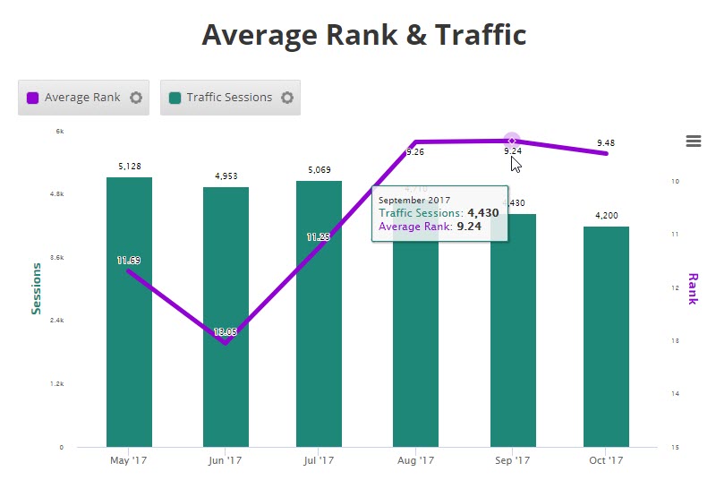
One of the benefits of the Insight Graph is the ability to blend metrics to tell a marketing story. In this example, Average Rank and Traffic Sessions are trended over a 6 month period.
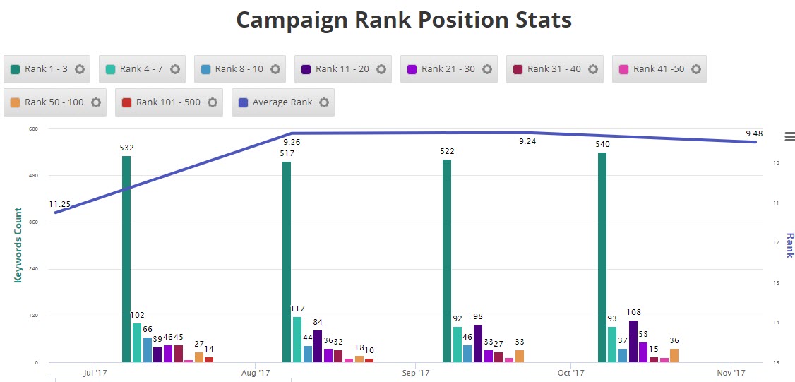
Average Rank with Rank Position Stats
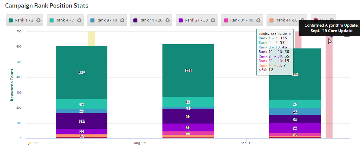
In this example, average rank has been added to a rank position stats graph
Video: How to Create an Average Rank(Desktop & Mobile) Insight Graph
Video: How to Create Competitor Rank Comparison Insight Graph
Custom SEO Keyword Rank Insight Graph
Keyword Rank Custom SEO Metric Options
Customize your Insight Graph using Results and Ranking Data filters for domain, keyword and search engine selections.
Metric Name
Enter the name that you want displayed as the legend label
Domain
Select from the list of domains being tracked for the campaign
Search Engine
Select All or one specific Search Engine
Results
Select all Rank results or filter Rank results by Top 10, Top 20, etc.
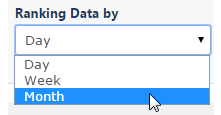
Ranking Data By
Display ranking data by Day, Week or Month
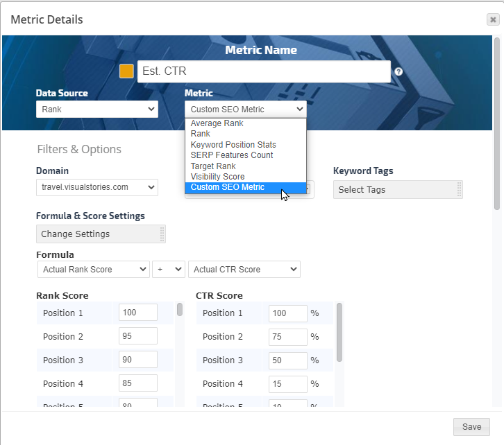
Custom SEO Metric Formula Options
This tool allows you to set the value of keywords that rank in positions 1 through 100. For example, a keyword that ranks in position 1 and has a monthly search volume of 5000 will have a higher potential click through rate than a keyword ranked in position 1 with
a monthly search volume of 100.
Under the Formula & Score Settings heading, click Change Settings
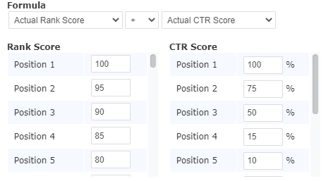
Select your preferred formula (more information below)
In the Rank Score section enter the numbers you want attributed to each of top 100 search engine result positions
In the CTR score section make any adjustments you want for the top 10 positions
Click the Save button
Formula options include any combination of these:
Rank Score
Actual Rank Score
logarithmic (Rank Score)
Base-10 logarithmic (Rank Score)
1- (Rank Score)
2* (Rank Score)
Operators
Plus
Minus
Multiply
Divide
Click Through Rate Score
Actual CTR Score
logarithmic(CTR Score)
Base-10 logarithmic(CTR Score)
2* (CTR Score)
Using logarithmic(Rank Score), Base-10 logarithmic(Rank Score), logarithmic(CTR Score) and Base-10 logarithmic(CTR Score):
These options reduce the high values to the smaller values in the graph as follows:
The logarithmic(Rank Score) and (CTR Score) are the mathematical functions of log(Rank Score) and log(CTR Score), which is use do make the Actual Rank Score and CTR Score smaller in case the values are very high. In this case it's a Natural log of Rank Score and of CRT Score => ln(Rank Score) and ln(CRT Score).
Base-10 logarithmic(Rank Score) and (CTR Score) is a 10 to the power of that is equals to the Actual values. For example, Actual Rank Score is 10000 => Base-10 log(1000) = 4 because 1000 = 10 to the power of 4.
Scale Type
Another way is to scale the graph by choosing Logarithmic Scale Type in the Chart Display Settings of the Metric Widget:
In this case the graph scale will be adjusted and the values will not be changed. In the below example the SERP Feature is with the max score of 2, while the Custom SEO Rank Score is in thousands(K). By applying the Scale Type to be Logarithmic the two graph combined with not a significant difference in the ratio but with the actual values.
Visibility Insight Graph
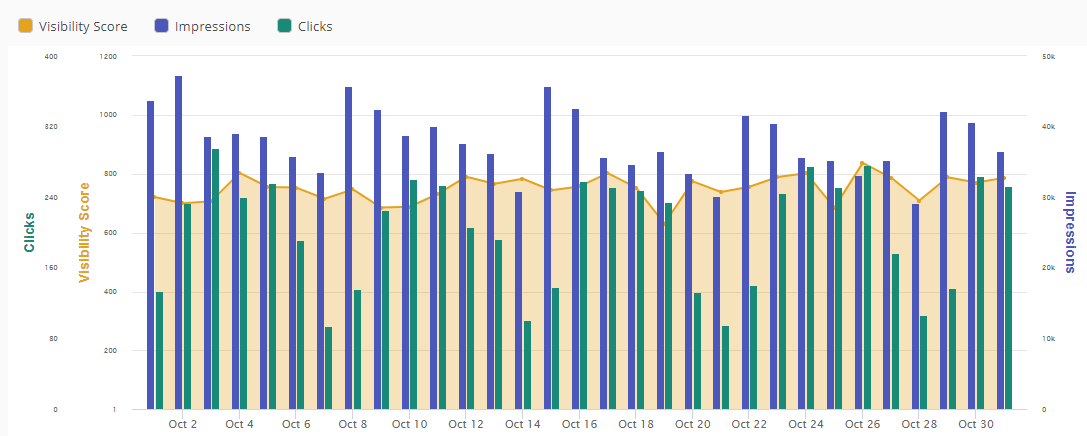
Using the Insight Graph it is possible to create a Visibility Graph with associated performance metrics, here are a few examples:
Visibility Score, Search Console Impressions and Clicks
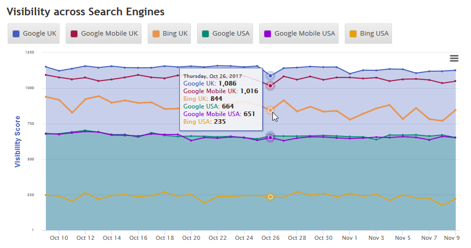
Site Visibility Multiple Search Engine Comparison
If you're tracking rank in multiple countries for an e-commerce site, for example, the Insight Graph has an enterprise feature that allows for cross-campaign metrics to be added. In this example, we've compared the search engine visibility in the UK and US on Bing organic, and Google organic and mobile.
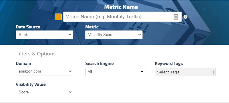
Visibility Metrics Options
Visibility is based on the position of ranking keywords and average search volume. The Visibility Score takes into account all tracked keywords for a website but can be adjusted to exclude certain keywords or search engines by using filters, however, the default settings will show the average of all keywords across all search engines being tracked for a website. The Visibility Score can also be presented as a percentage value.
Metric Name
Enter the name that you want to be displayed as the legend label
Domain
Select from the list of domains being tracked for the campaign
Search Engine
Select All or one specific Search Engine
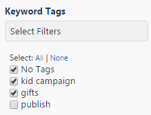
Keyword Tags
Click in the Select Filters field and select the keyword tags you want to filter rank data for in the graph
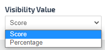
Visibility Value
Select Score or Percentage to display the value of the Visibility either as a number or as a percentage value.
Adobe Analytics Insight Graph
Adobe Analytics Metrics
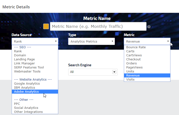
To build an Insight Graph using Adobe Analytics data, select:
Important: all available Adobe metrics are enabled. If you have connected your Adobe account and an Adobe Report Suite to a Rank Ranger campaign and you receive a "No Data for Series" error in the Insight Graph, that means that the metric that was selected has not been enabled in the Adobe account for the selected Report Suite. If you enable the metric in Adobe, then data will be available in Rank Ranger.
AWeber Insight Graph
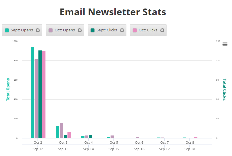
You can create Insight Graphs with AWeber email list statistics. In this example we've compared the number of Opens (email read), and Clicks (through to links in the email) between 2 monthly newsletters.
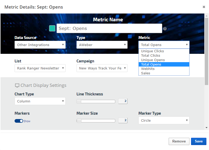
In an Insight Graph, add a Metric and select:
Data Source: Other Integrations
Type: AWeber
Metric: Total Opens, Unique Opens, Total Clicks, Unique Clicks, Sales or Webhits
List: AWeber accounts can have multiple mailing lists, select the one you want for this graph
Graph Settings
In both the Insight Graph and Metric Widgets:
Enter a Metric Name for display in the graph
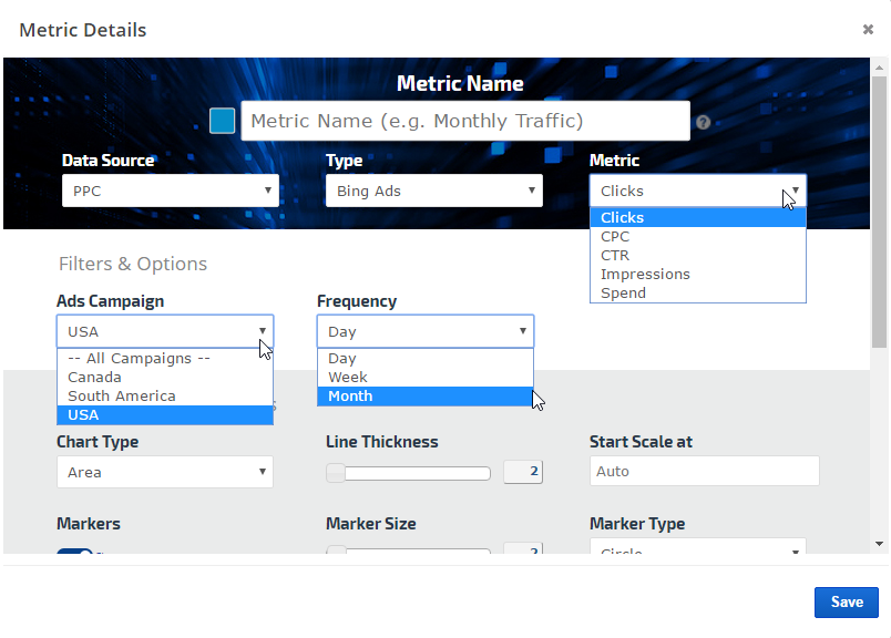
Data Source: PPC
Type: Bing Ads
Metric: Clicks, CPC, CTR, Impressions, or Spend
Select the desired color and other display and date settings, and click the Save button.
Repeat for each individual metric that you want included on the graph.
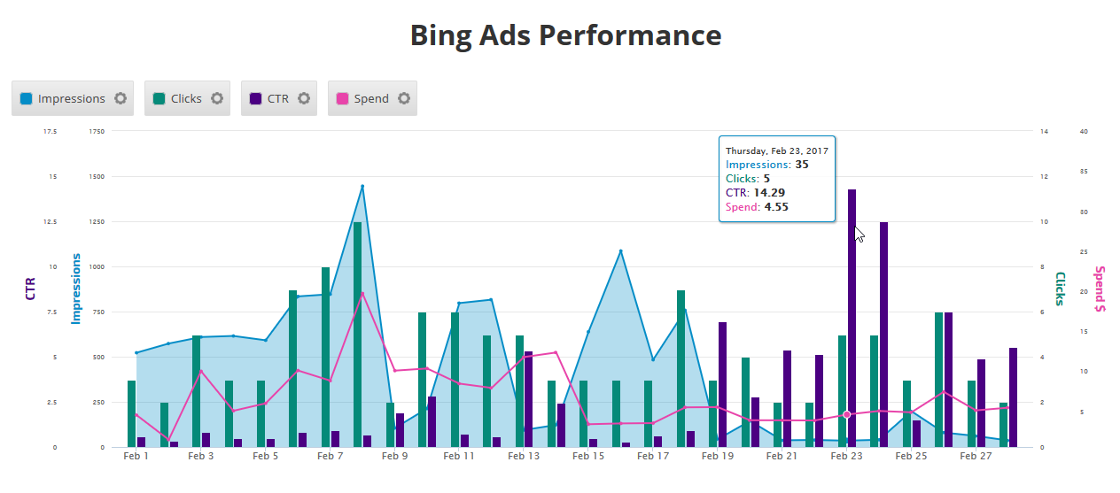
Bing Ads Insight Graph Example
Bing Webmaster Tools Insight Graph
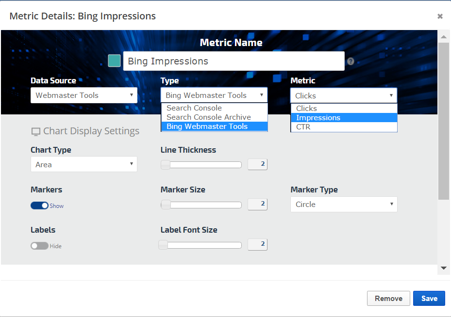
Create Insight Graphs using Bing Webmaster Tools data
A Bing Webmaster Tools connection to a Rank Ranger campaign provides the Insight Graph with a variety of Bing website analytics data:
Impressions: the number of times the page appeared in search results
Clicks: clicks that were directly from search results
CTR: the click-through-rate (percentage of impressions that resulted in clicks)
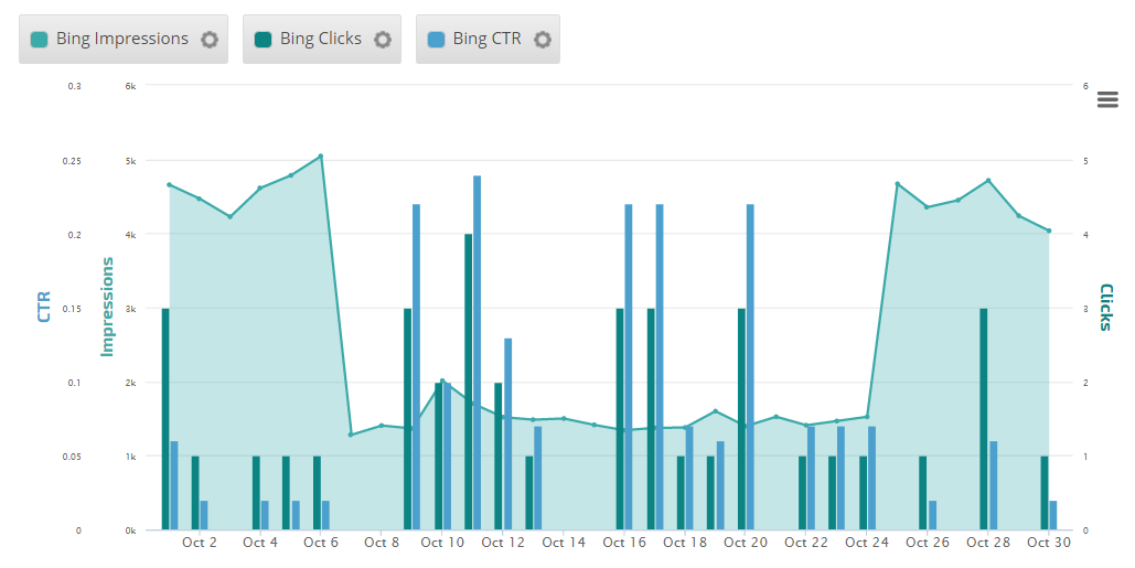
Insight Graph
In this example, Bing Webmaster data is displayed in an Insight Graph.
Create Custom Views Insight Graph
Three categories of metrics are available in the Insight Graph:
Campaign Metric: this allows data only from the campaign it is being created in
Cross Campaign Metric(Enterprise only feature): this allows data from any account campaign
Custom View Metric: this allows data from multiple campaigns to be aggregated (learn more...)
Add Custom View Metric
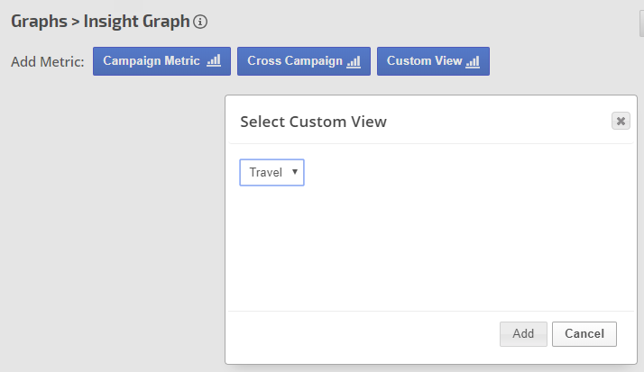
After creating custom views with data groups in Tools > Custom Views, you can click the Custom View button in the Insight Graph and select from the list of views that have been created in your account.
Select a Custom View and click the Add button
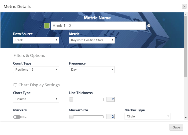
Add a Metric, you can choose from Rank:
Keyword Position Stats
Visibility Score
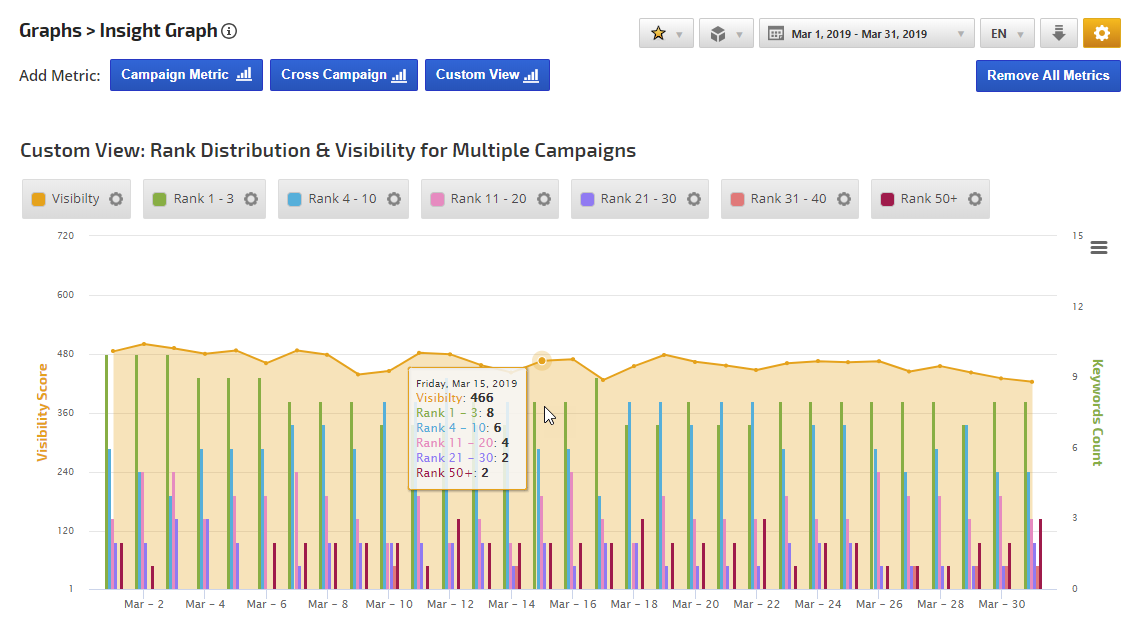
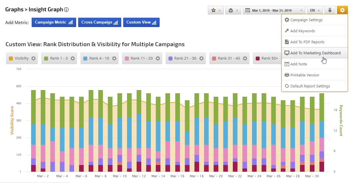
Insight Graph Example: Rank Distribution & Visibility for Multiple Campaigns
This graph was created by adding the following Custom View metrics:
Visibility Score with Area chart type
6 Rank Position Stats metrics for different rank positions with Column chart type
Change to Stacked Columns View
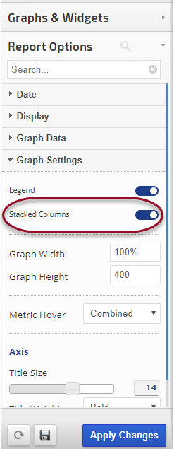
After adding all the metrics, if you've adding Column chart type you can change the Graph Settings to display as Stacked Columns and click the Apply Changes button.
Insight Graph Example: Customs Views with Stacked Columns
Results after building a column graph and enabling Stacked Columns in Report Options > Graph Settings
To add this graph to a Marketing Dashboard or PDF Report, hover over the gear icon in the upper right and select the option and follow the on-screen instructions.
Edit Custom View
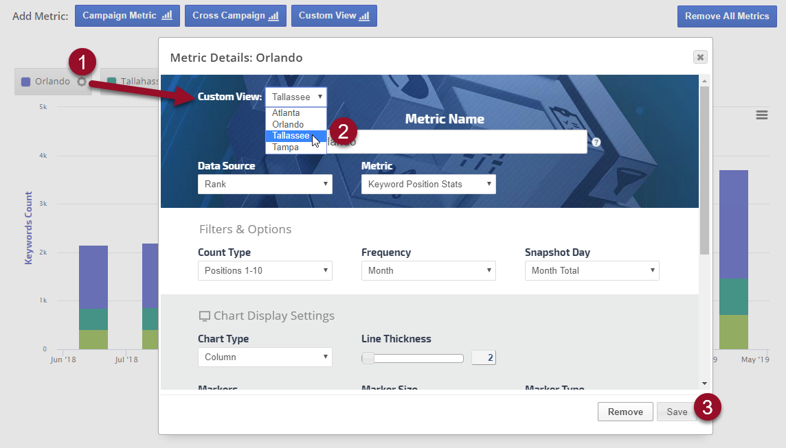
After saving a custom view metric, you can change the view:
1. Click the metric's gear / settings icon
2. Select a different Custom View
3. Click the Save button
Domain Backlinks Insight Graph
Domain Metric Options
Metric Name
Enter the name that you want displayed as the legend label
Domain
Select from the list of domains being tracked for the campaign
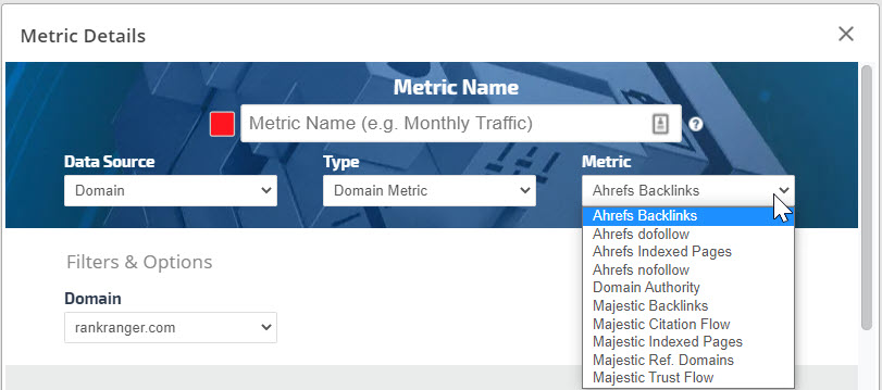
Domain Metric
Select from a variety of Ahrefs, Majestic, Alexa, and Domain Authority metrics
Graph Settings
In both the Insight Graph and Metric Widgets:
Enter a Metric Name for display in the graph
Data Source: PPC or Social Analytics (the data is available in both categories)
Type: Facebook Ads
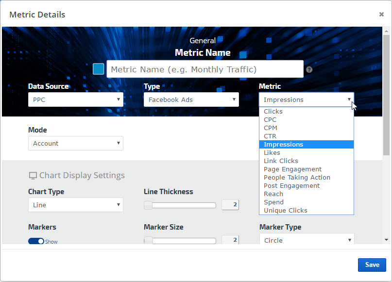
Metric: Clicks, CPC, CPM, CTR, Impressions, Likes, Link Clicks, Page Engagement, People Taking Action, Post Engagement, Reach, Spend, or Unique Clicks
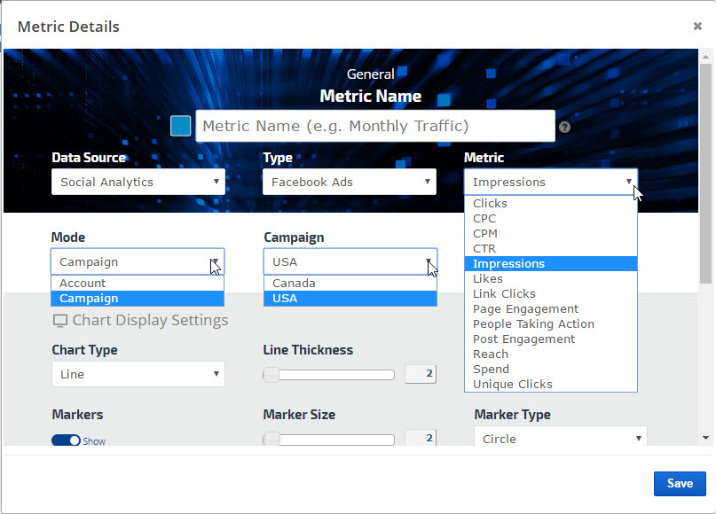
Mode: Account or Campaign. If Campaign is selected, then also select the Campaign name in the next field
Select the desired color and other display and date settings and click the Save button.
Repeat for each individual metric that you want included on the graph.
Example of Account Mode
Example of Campaign Mode
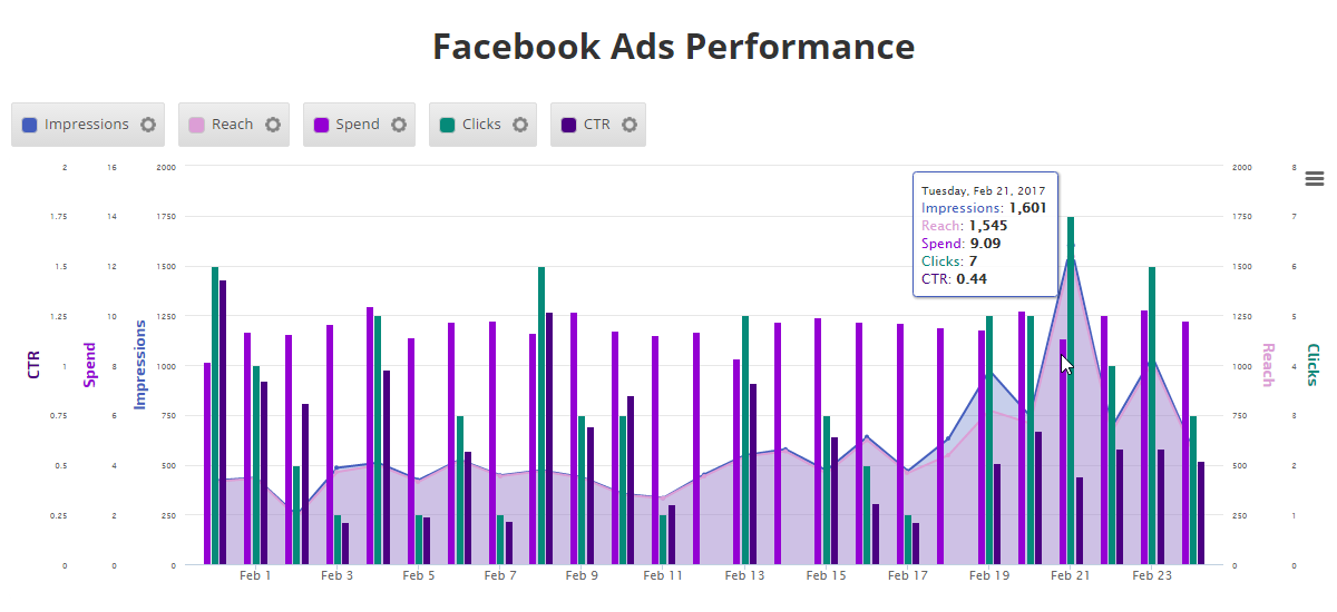
Facebook Ads Insight Graph
Featured Snippet Rank Insight Graph
Featured Snippets become Rank Position 1
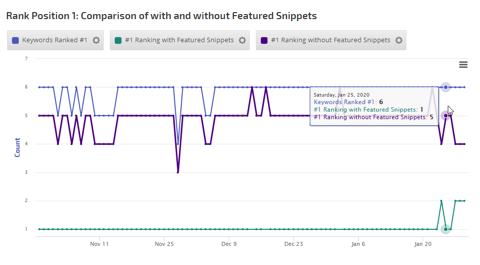
On January 23, 2020 Google changed the way Featured Snippets vs organic rank are treated in search results (learn more...). Featured Snippets are now considered to be rank position 1 and the link displayed in them is no longer repeated as a separate organic result on page 1. As such, due to the prominence of the featured snippet's visibility (and potential for click through), we have adapted our tracking to include Featured Snippets as rank position 1 when a keyword we're tracking for you displays a URL in it.
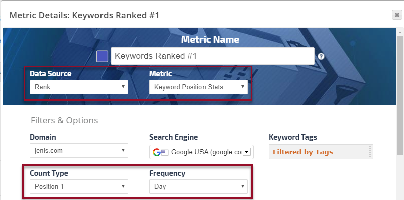
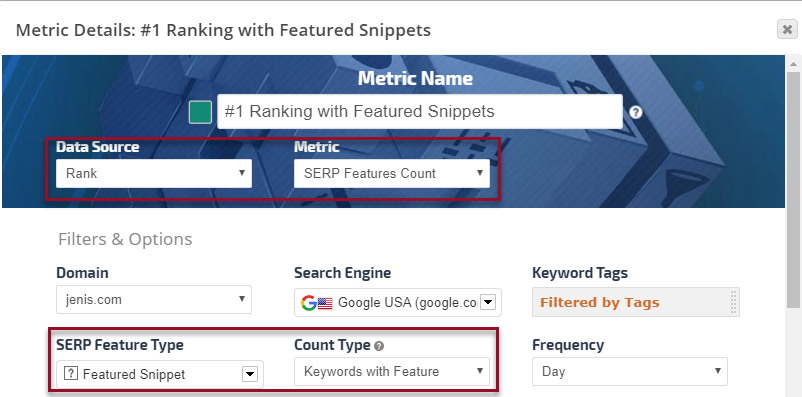
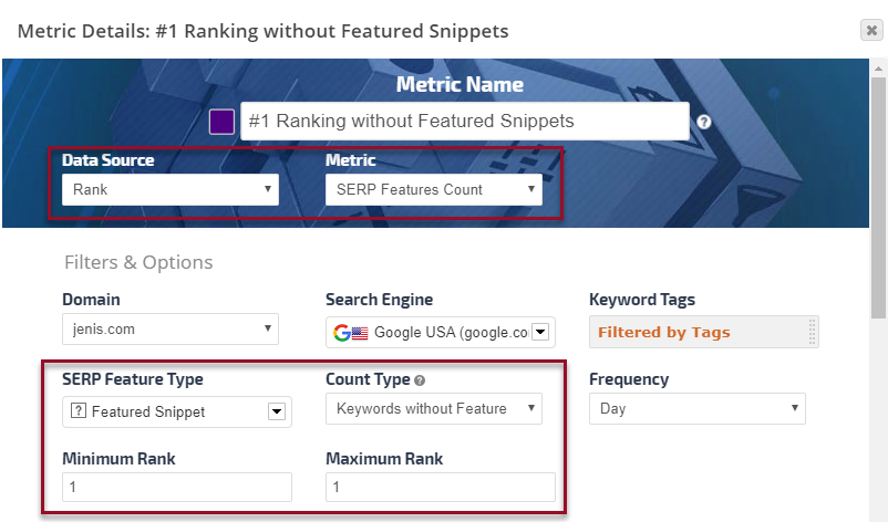
To help you determine if Google's decision has affected a site's SERP performance, we've enabled settings in the Insight Graph that can be used to create a Rank Position #1 trends graph like this example.
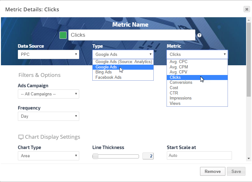
These are the settings used to create the above graph:
Ads Campaign: all campaigns combined or individual campaign
Markup on Cost or Avg CPC: percentage of markup over the actual cost or CPC. This can be useful if your client has given you an advertising budget and you want to include an overhead cost in that charge to be displayed in their graph. For example, if you want to add 50% to the Ads spend, then enter 50 in the Markup on Cost field.
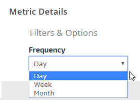
Frequency: default is day, additional options are for week or month. This setting determines the frequency of data points on the line or column
Select the desired color and other display and date settings, and click the Save button.
Repeat for each individual metric that you want included on the graph.
Graph Settings
In both the Insight Graph and Metric Widgets:
Enter a Metric Name for display in the graph
Data Source: PPC
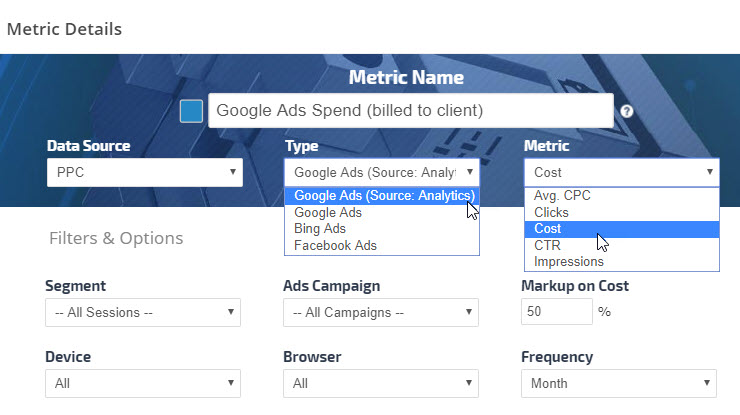
Type: Google Ads (Source: Analytics)
Metric: Avg CPC, Clicks, Cost, CTR, or Impressions
Optional filters and settings include:
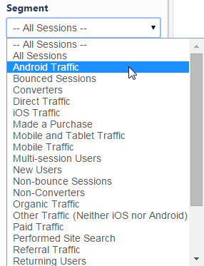
Segments: choice of Google's segments or custom segments that you have created in your account
Ads Campaign: all campaigns combined or individual campaign
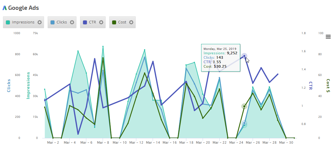
Markup on Cost or Avg CPC: percentage of markup over the actual cost or CPC. This can be useful if your client has given you an advertising budget and you want to include an overhead cost in that charge to be displayed in their graph. For example, if you want to add 50% to the Ads spend, then enter 50 in the Markup on Cost field.
Device: default is All, however, you may filter the metric for desktop, mobile or tablet
Browser: default is All, but you may filter for a specific web browser
Frequency: default is day, additional options are for week or month. This setting determines the frequency of data points on the line or column
Select the desired color and other display and date settings, and click the Save button.
Repeat for each individual metric that you want included on the graph.
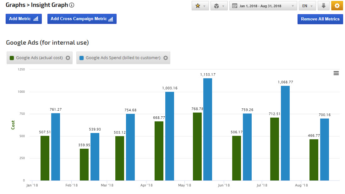
Ads Cost Markup Insight Graph Example
In this example, the Markup Cost option has been added for internal use to display the Google Ads spend vs. the overall cost of Google Advertising.
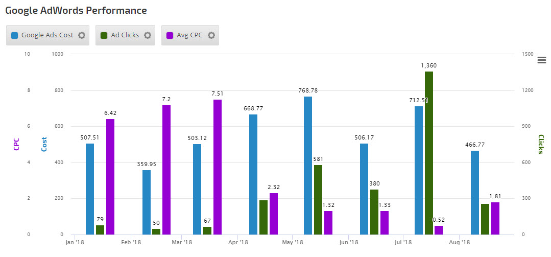
Google Ads Performance Graph example
In this example, we've chosen Ad Cost, Ad Clicks and Average Cost per Click metrics to display the improvement in Ads campaign performance. By selecting individual metrics from different Ads campaigns, a graph can be created to compare the performance between campaigns as well.
Google Analytics Insight Graph
Google Analytics Options
Metric Name
Enter the name that you want displayed as the legend label
Analytics Metric
Select the Google Analytics metric type you want included in the Insight Graph: ECommerce, Event Tracking, General, Goals, Multi-Channel Funnels or Site Speed and then select the exact metric (detailed below). You can add multiple Analytics metrics to one graph along with other metric types for a comprehensive blend of SEO data.
Google Analytics ECommerce Metrics
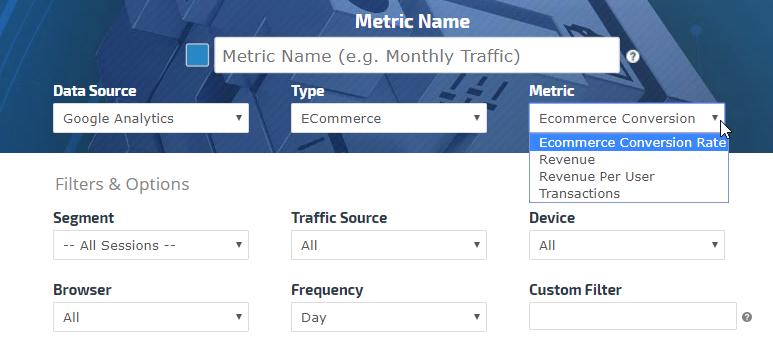
Choose from Transactions, Revenue, Revenue Per User or Ecommerce Conversion Rate. This metric can be filtered by Segment, Traffic Source, Device, and Browser. Frequency can be set to Day, Week or Month and a Custom Filter option exists for people with experience using Google's Metric Filter and Dimension Filter clauses.
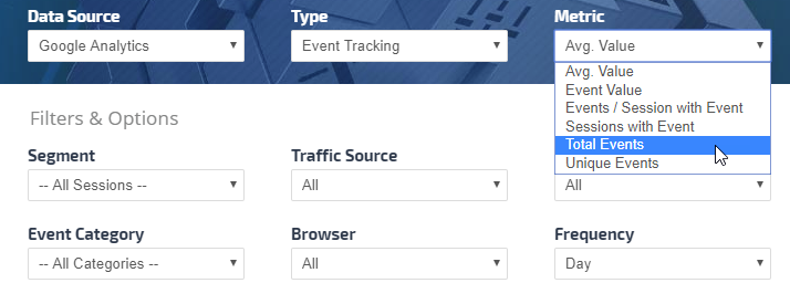
Google Analytics Event Tracking Choose from Average Value, Event Value, Events per Session with Event, Sessions with Event, Total Events or Unique Events. This metric can be filtered by Segment, Traffic Source, Device, Event Category and Browser. Frequency can be set to Day, Week or Month.
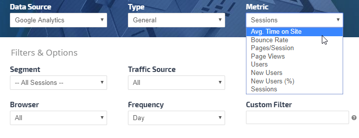
Google Analytics General Session Data Choose from Average Time on Site, Bounce Rate, Pages/Session, Page Views, Users, New Users, New Users % or Sessions. This metric can be filtered by Segment, Traffic Source, Device, and Browser. Frequency can be set to Day, Week or Month and a Custom Filter option exists for people with experience using Google's Metric Filter and Dimension Filter clauses.
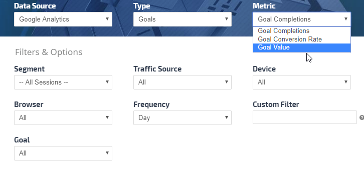
Google Analytics Goals Metric: Choose from Goal Completions, Goal Conversion Rate or Goal Value. This metric can be filtered by Segment, Traffic Source, Device, Browser and for a specific Goal by selecting it from the Goal menu. Frequency can be set to Day, Week or Month and a Custom Filter option exists for people with experience using Google's Metric Filter and Dimension Filter clauses.
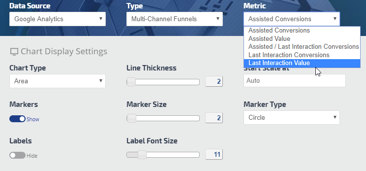
Multi-Channel Funnels Choose from Assisted Conversions, Assisted Value, Last Interaction Conversions, Last Interaction Value or Assisted / Last Interaction Conversions.
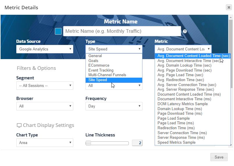
Google Analytics Site Speed Choose from a full list of Site Speed metrics in seconds, milliseconds and Google samples. This metric can be filtered by Segment, Traffic Source, Device, and Browser. Frequency can be set to Day, Week or Month and a Custom Filter option exists for people with experience using Google's Metric Filter and Dimension Filter clauses.
Google Analytics Internal Search
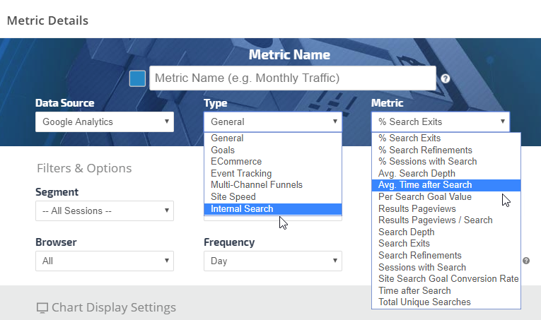
Create a graph detailing the internal website search behavior of visitors by selecting the Google Analytics type: Internal Search, and one of a variety of metrics.
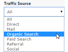
Traffic Source
Select All or a specific Traffic Source (direct, mail, organic search, paid search, referral or social) to filter graph data
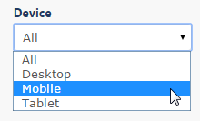
Device
Filter results by Desktop, Mobile or Tablet traffic, or select All.
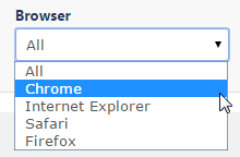
Browser
Select All or filter results by Browser: Chrome, Firefox, Internet Explorer, Safari.
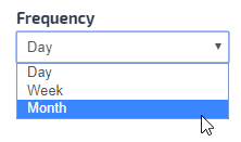
Frequency
Display data by Day, Week or Month
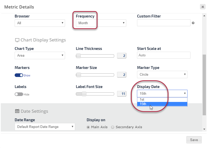
Chart Display Date
For Google Analytics metrics in Insight Graphs, when the Frequency is set to Month, there is an option in Chart Display Settings for you to select a Display Date, either the 1st or 15th of the month. That setting determines the position (for comparison with other metrics) in the graph where the marker displays the metric number, however, the actual metric date is based on the report settings. If the report dates cover a 12 month period and the graph is set to monthly frequency, then the number that displays is the month's total - it displays the same number whether the marker is on the 1st or the 15th.
The system requires a date be selected because Insight Graphs allow the mixing of multiple metric types, so if for example daily or weekly Visibility Score or Average Rank were added to a graph along with Analytics data, the Analytics data needs to match with a date of those metrics during the month.
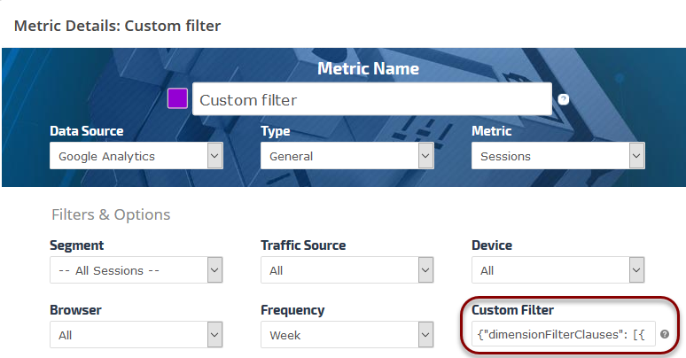
Google Analytics Custom Filters
The Custom Filter option is intended for expert level Google Analytics users who prefer to build their own filters. For the Custom Filter syntax, please refer to Google's support documentation:
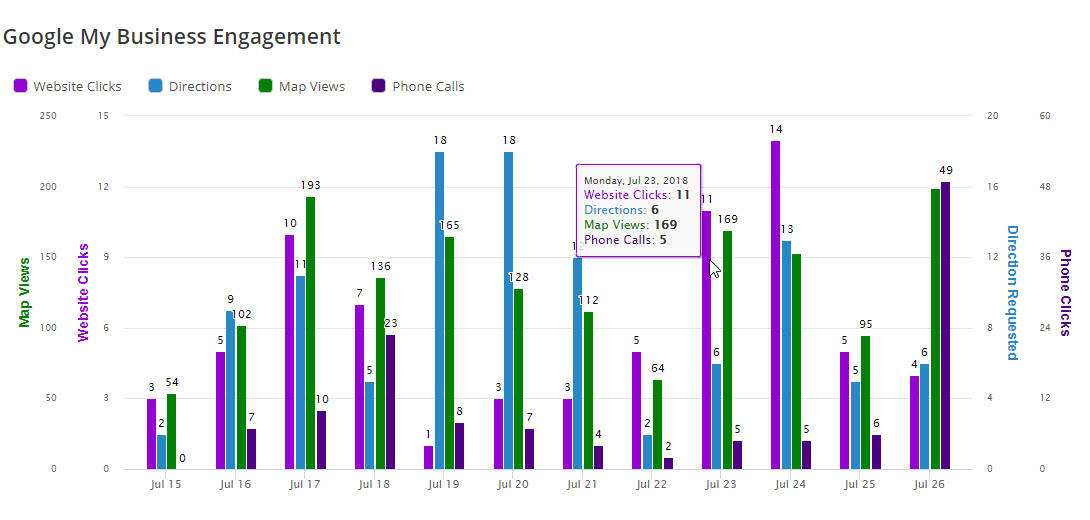
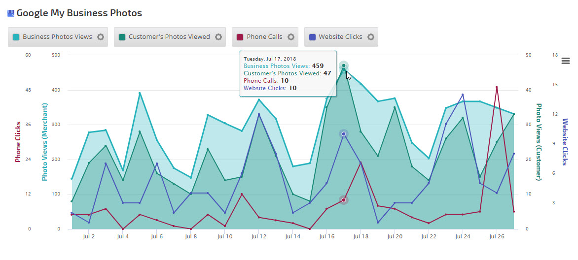
In this example 4 metrics were selected with 2 displaying with the Area chart type and 2 with the Line option.
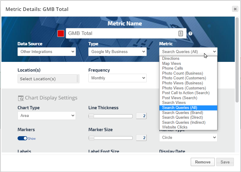
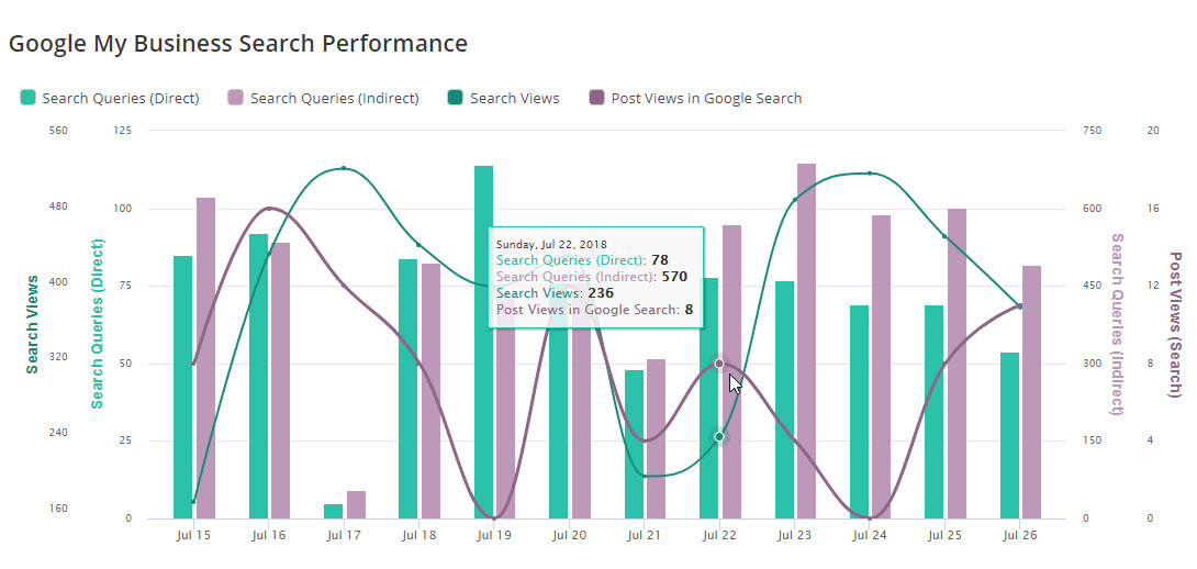
GMB Search Queries, Search Views & Post Views in Google Search
In this example we charted 2 metrics using the Column chart option and 2 using the Curved Line option.
Google Search Console Insight Graph
Google Search Console Options
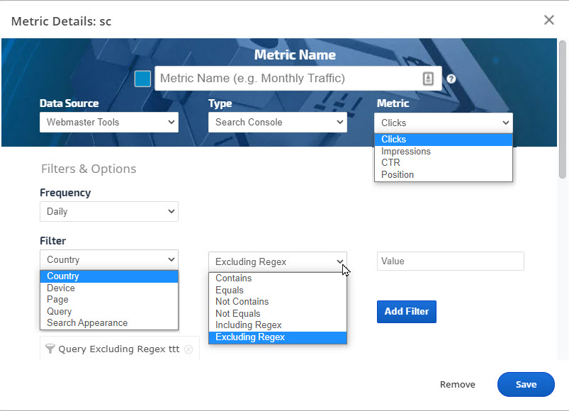
Enter the Metric name that you want to be displayed as the legend label. In the Data Source field select Search Console, and in the Metric field select from the available data types: Clicks, Impressions, CTR (click-through rate), or Position.
Refine the data you want to be displayed in the Insight Graph by selecting a Filter (e.g., Country, Device, Page or Query) and defining Option (e.g., Contains, Equals, Not Contains, Not Equals, Including Regex or Excluding Regex) and complete the filter by entering a Value, then click the Add Filter button. Filters & Options are available for current Search Console data (not archived data).
Please note that there can be a 3 to 5-day delay between the time Google compiles and releases this data via their API.
Archived Search Console Data
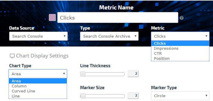
If you have selected the Enable RangerBot to store your monthly Search Console history in our Big Data Center in the Campaign Settings, then you can add that data to an Insight Graph for visual trending by selecting Type: Search Console Archive and selecting either Clicks, Impressions, CTR or Position in the Metric field.
Search Console data is stored based on calendar months without filters. The options include:
Daily totals for Clicks, Impressions, CTR, and Position
Unfiltered Keyword totals for up to 5000 queries
Unfiltered Landing Page totals for up to 5000 pages
Search Console Insight Graph example
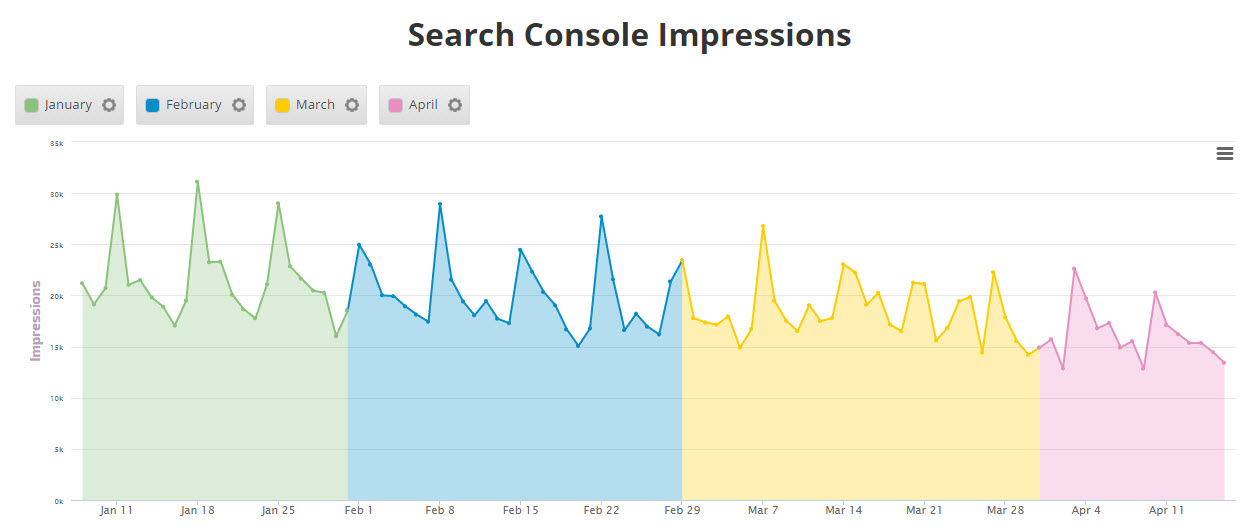
In this example, we've included both current and archived Search Console data to create a visualization of the trend of Impressions for a site.
Google SERP Features Count (Domain) Insight Graph
If you want to visually trend and share the number and type of SERP Features for a tracked domain in dashboards and PDF reports, you can create a custom Insight Graph using the Rank > SERP Features Count metric. The SERP Features Count metrics are based on the tracked domain's URLs displaying in search results with the feature. Available metrics include:
AMP
Breadcrumbs
Carousel
Featured Snippet
HTTPS
Image Thumbnail
Local Result (requires setting up the Business Results in the Search Engine Advanced Search Settings, where the "Include in Organic rank count" to be selected and Business Name to be specified. Note: the results will be showing only if the domain is listed in the Local Pack)
Phone
Rating
Search Box
Sitelinks
Structured Snippets
Top Stories
Video Thumbnails
SERP Features that do not contain organic links directly to the tracked site are not included in this metric (e.g., App Box, Direct Answer, Hotel Pack, Image Box, Google for Jobs Box,
Knowledge Panel, PLA, Rich Cards, Related Questions, and Video Carousel).
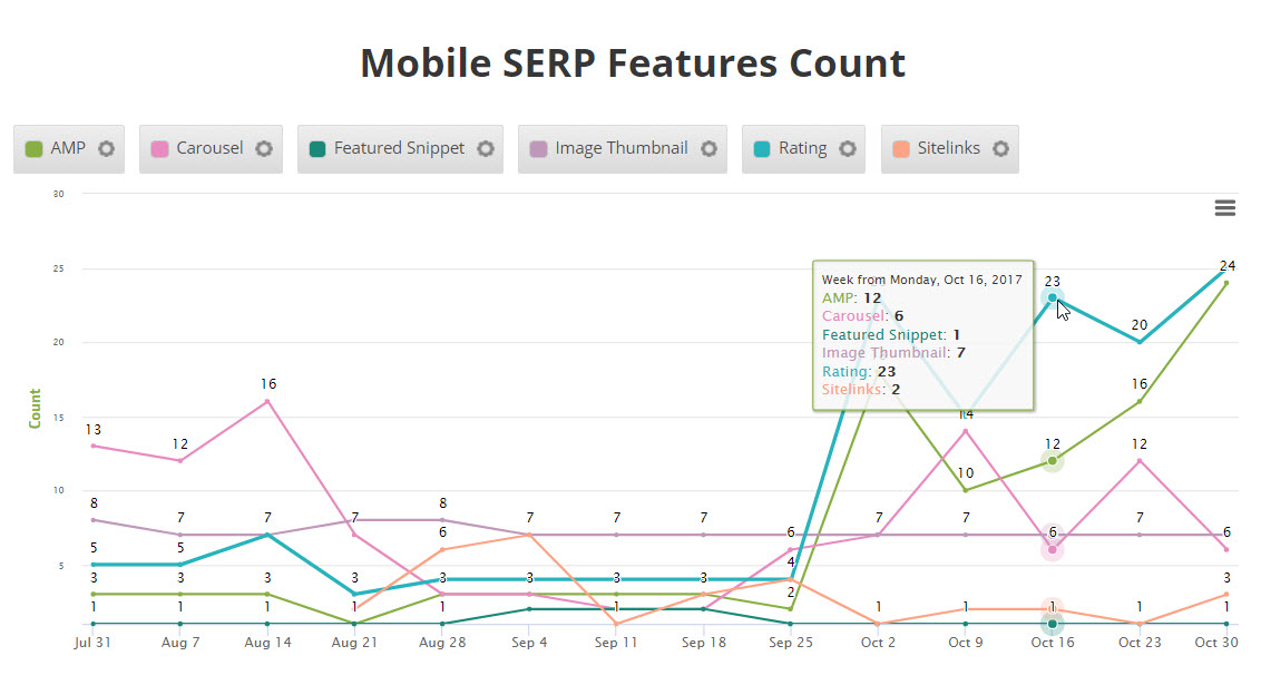
In this example, the SERP appearance trend for AMP, Carousel, Featured Snippet, Image Thumbnail, Ratings, and Sitelinks are presented for one website.
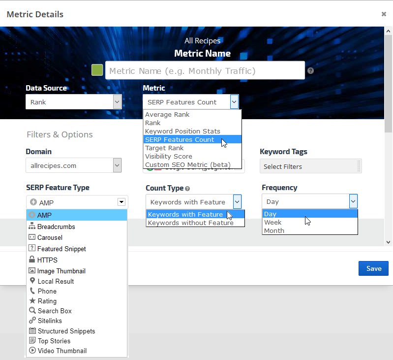
In an Insight Graph, add a Metric and name it, then select:
Data Source: Rank
Metric: SERP Features Count
Domain: select a website
Search Engine: select a search engine
Keyword Tags: select tags to filter the report data (optional)
SERP Feature Type: select from the list of available SERP Features
Count Type: select to display Keywords with Feature, or Keywords without Feature
Frequency: select Daily, Weekly, or Monthly
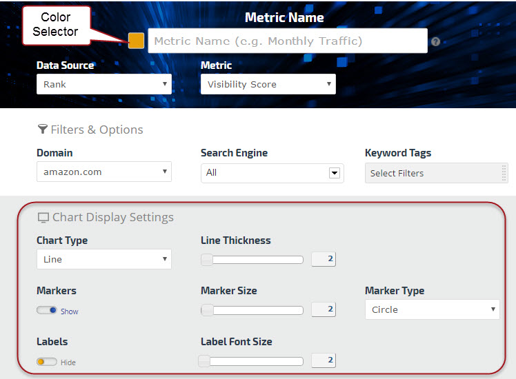
Color Palette
Click the color block that displays to the left of the metric name you entered and select the color that you want displayed in the graph
Chart Display Settings
Select a Chart Type. If you want a graph similar to the example above, then select Chart Type: Line.
Show or hide Markers (shapes, usually used for line charts) and Labels (the metric numbers), and if shown, then select the size and type.
Compare Competitor SERP Features in a Graph
Utilizing the Line chart type, this Insight Graph provides a colorful trend analysis of the Ratings SERP Feature for a site and its competitors. Hovering over any point on the graph reveals each site's ratings for the selected period.
Google SERP Features Tool Insight Graph
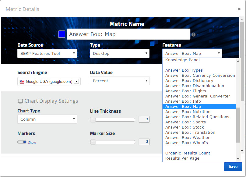
Google SERP Features Options
Insight Graph SERP Metrics are available in Enterprise packages. This data makes it possible to trend and analyze Organic SERP Indicators, Knowledge Graph Features, Page One Extras and Organic Results Count as detailed below this screenshot.
Knowledge Graph Features:
Knowledge Panels, Featured Snippets, Carousels, and Answer Boxes and
types (e.g., Currency Conversion, Dictionary, Disambiguation, Flights, General Converter, Info, Map, Nutrition, Related Questions, Sports, Stock, Translation, Weather and WhenIs)
Page One Extras: Ads and ad positions, Images (Box), Local Pack, News (Box), and Related Search
Organic Results Count: breakdown of the number of Results per Page
Some SERP metrics also have options to display data either by the average number of occurrences per page or as a percentage.
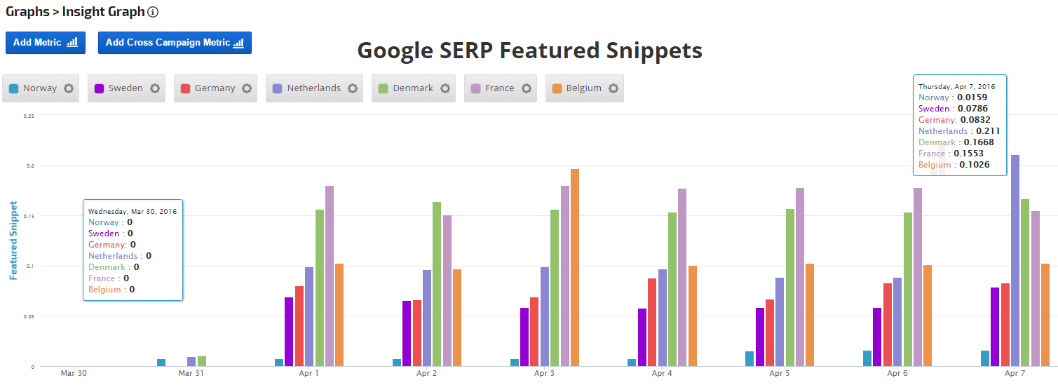
Google SERP Features Insight Graph
In this example, we compared SERP Featured Snippets in 7 European countries the day we noticed their sudden appearance in the search engine results between March 30th and April 1st.
Google Sheets Data in Insight Graph
Integrate Google Sheets data with marketing metrics in an Insight Graph
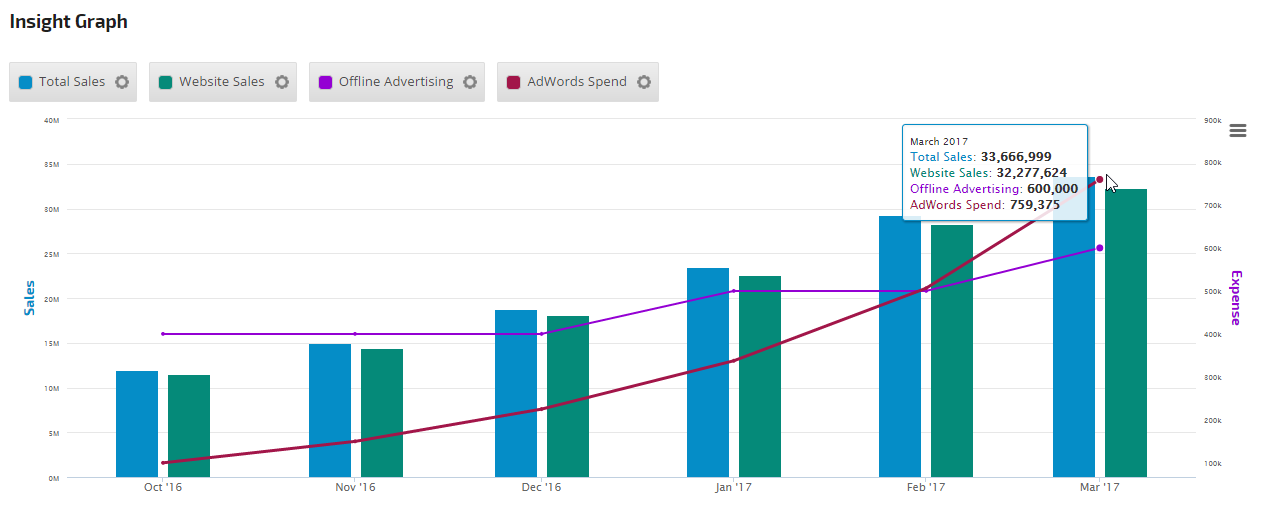
Google Sheets integration makes it possible for you to produce a graph with internal company data (e.g., sales, offline advertising, net profit, etc.) that is not available via third-party integration. That data can easily be blended in a graph with our search engine rank and backlink data, search traffic, social media and email campaign performance, and more.
In this example, we've used Google Sheet data for the Total Sales and Offline Advertising expense, and added Website Sales (from Google Analytics tracking) and AdWords Spend per month (AdWords must be linked to your Google Analytics profile - refer to Link Google Analytics and AdWords).
Insight Graph displaying data from Google Sheets, Analytics and AdWords
Add Google Sheets Metric
Open an Insight Graph or Metric Widget and select:
Data Source: Other Integrations
Type: Google Sheets
In the Spreadsheet field, copy and paste the URL of the Google Sheet containing the data
Define the Metric Data
Select the Sheet name from the menu (each tab in Google Sheets has a label name, e.g., Sheet1, Sheet 2, or user assigned custom names)
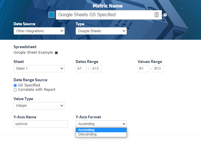
There are two options on how the data to be retrieved from the Google Sheet depending on the Data Range Source selection:
GS Specified (Google Sheet Specified - where the only the cells range specified for Dates Range and Values Range from the Google Sheet to be displayed in the Insight Graph.)
Dates Range - Enter the start cell and end cell that contain the dates
Values Range - Enter the start cell and end cell that contain the values
Correlated with Report (The dates are matched to the Insight Graph Date Range selected in the report and the data dynamically changes when the report data range is changed.)
Dates Range - Recommended to specify the column of the dates in order to capture the future populated dates, for example A for the start and A for the end date
Values Range - Recommended to specify the column of the values in order to capture the future populated values, for example B for the start and B for the end values
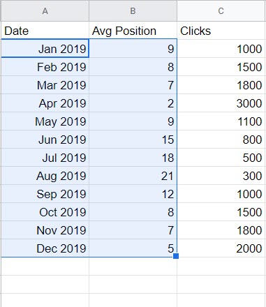
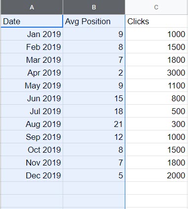
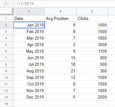
Using the following Google Sheet example, the Insight Graph settings in the previous image correspond to a Date Range from cells A2 - A13; January 2019 - December 2019, and Avg Position from cells B2 - B13.
Important! Dates must be entered in the Google Sheet as numbers only (e.g., MM/DD/YYYY) regardless of the display format when viewing Google Sheets. In the above screenshot, Jan 2019 is displaying, but if you look in the fx cell the date is 1/1/2019.
Value Type: select Decimal or Integer
Y-Axis Name and Format Settings
By default each metric has its own separate Y Axis with a label matching the Metric Name field.
If you want the Y Axis name to be different than the metric name, you can enter the label in the Y Axis name field.
If you want a group of metrics all
plotted on the same Y axis, then enter the same Y Axis name when adding
each metric.
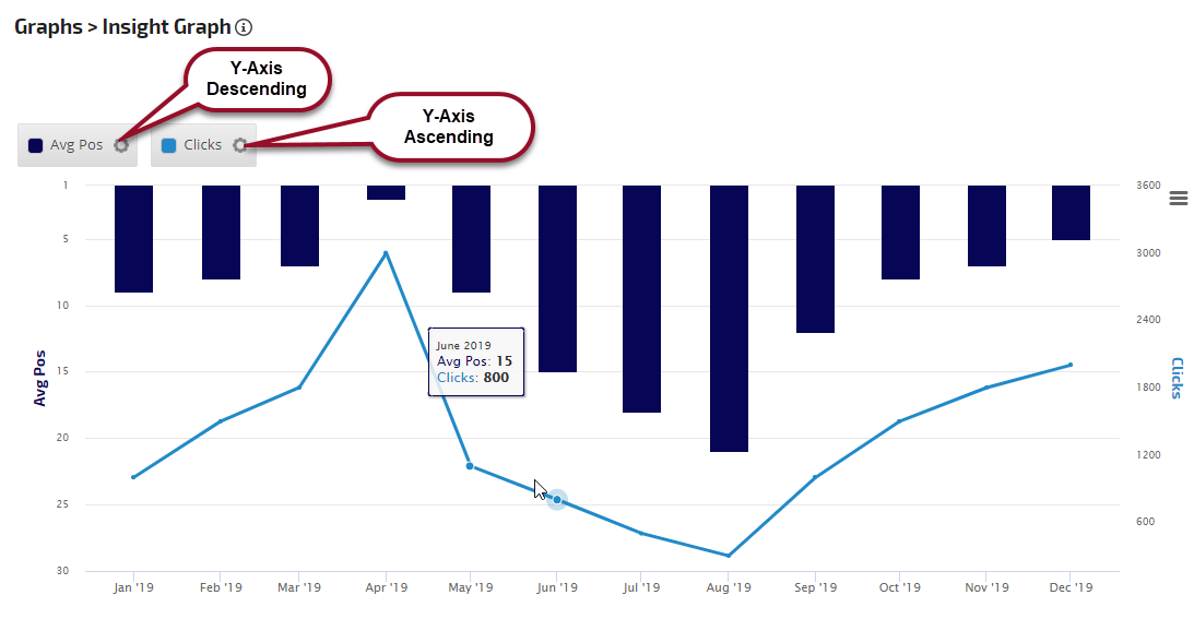
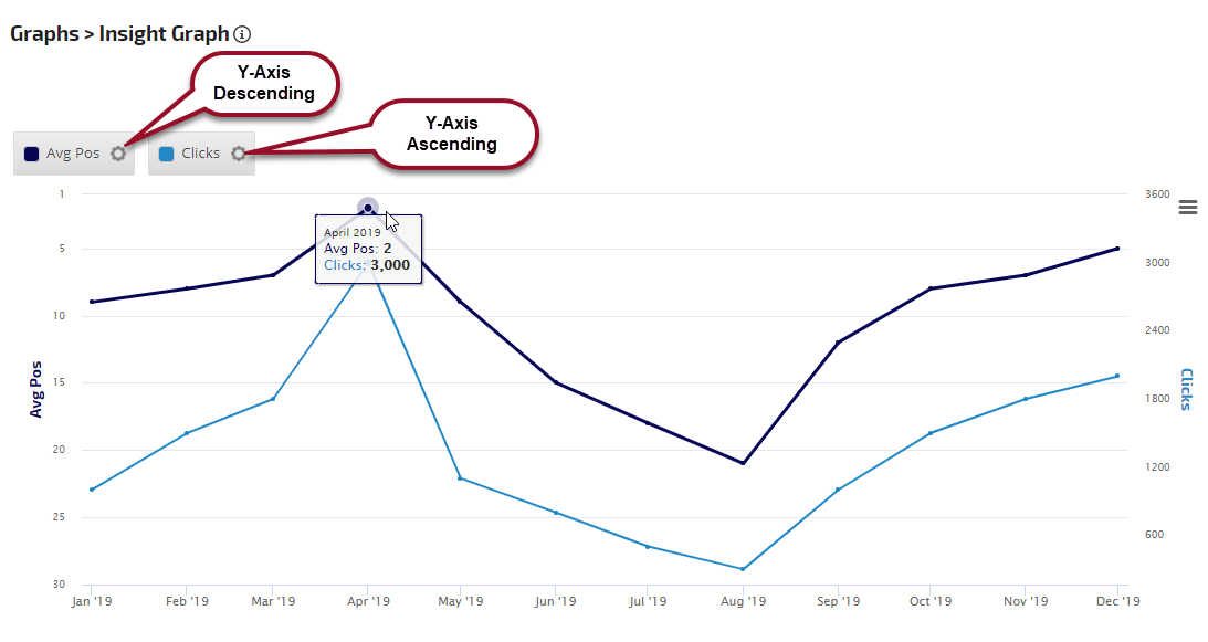
You can set the Y-Axis data to display in ascending or descending order.
Y-Axis Format Examples
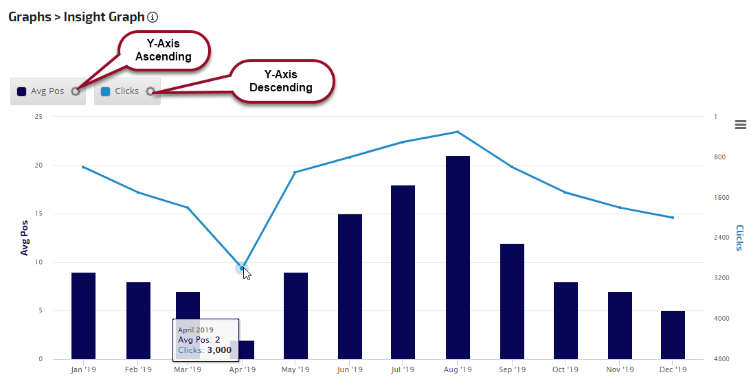
In this example, the Avg Pos metric has a Y-Axis setting of Ascending, and the Clicks metric's Y-Axis is set to Descending to make a visual correlation between the average position and number of clicks.
In this example, the settings are reversed
In this example, the Avg Pos metric is displayed as a line with Y-Axis in Descending order and Clicks are set to Y-Axis Ascending order.
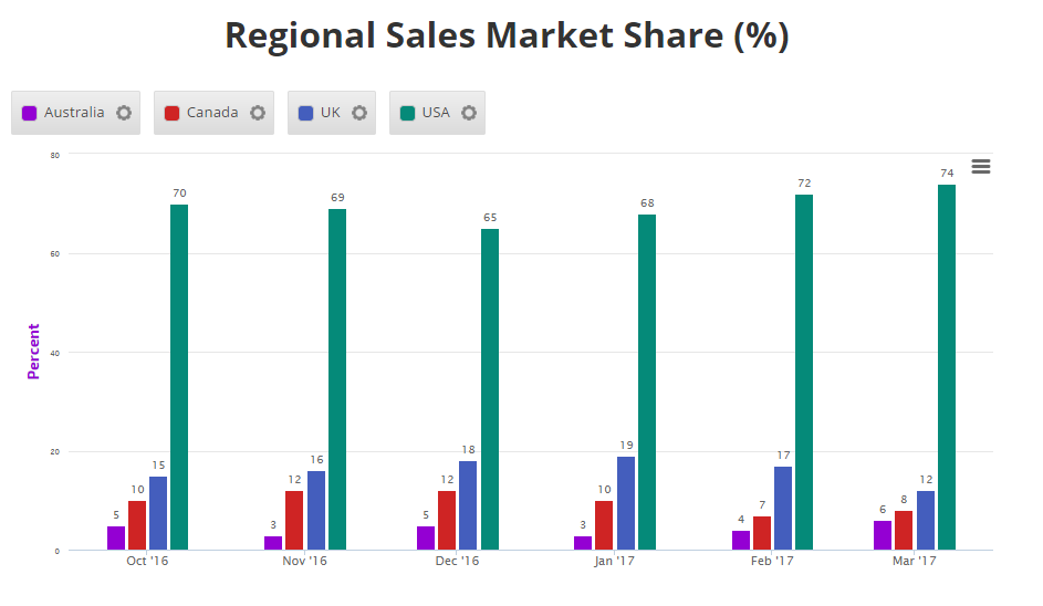
Insight Graph with Shared Y-Axis
In this example, "Percent" was entered in the Y Axis name field of all 4 metrics to cause them all to be graphed on the same scale.
Refer to Metric Display Settings to learn more about colors, chart types, markers, labels and date options.
Troubleshooting Google Sheets data in an Insight Graph
If the Google Sheet data does not appear on the screen at all:
Confirm that the campaign is connected the Google Drive account that the Sheet is located in.
Confirm that the connected Google account has not exceeded Google's Service Quota. Every time you or anyone you've shared online reports with loads or refreshes a screen, the data is called from Google's API. Therefore, we recommend only using Google Sheets for data that is not available in Rank Ranger via the variety of integrations that we offer.
If you see a 0 or a flat line at the 0 position for dates that do have data in your Google Sheet, that means that the selected range of values in the metric is incorrect and you need to replace it with the correct column and row references.
If the Google Sheet that you originally referenced in a metric has been modified in such a way that row numbers or column letters changed, then you need to update each metric previously added in Rank Ranger to match the new data structure (e.g., if you referenced data in Value Range B1:B12 and then inserted a column to the left of column B that changes it to column C, then you need to change the Value Range to C1:C12 in your Rank Ranger metrics).
If after following the above instructions, your Insight Graph doesn't display the data correctly from your Google Sheet:
Share that Google Sheet with service@rankranger.com and
Send an email to service@rankranger.com with the campaign name and Insight Graph location, for example:
Campaign Insight Graph report screen
Marketing Dashboard, along with page name and Insight Graph custom title
Client Dashboard
PDF Report name, along with Insight Graph custom title
Include screenshots or video of a specific behavior you experienced, if possible
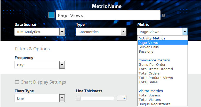
IBM Coremetrics Insight Graph
Create Insight Graphs using IBM Digital Analytics
An IBM Coremetrics connection to a Rank Ranger campaign provides the Insight Graph with a variety of IBM Digital Analytics data:
Activity Metrics: Page Views, Server Calls and Sessions
Commerce Metrics: Items per Order, Total Items Ordered, Total Orders, Total Product Views and Total Sales
Visitor Metrics: Total Buyers, Total Visitors and Unique Registrants
Data can be displayed by day, week or month.
Insight Graph
In this example, IBM e-commerce data is displayed in an Insight Graph.
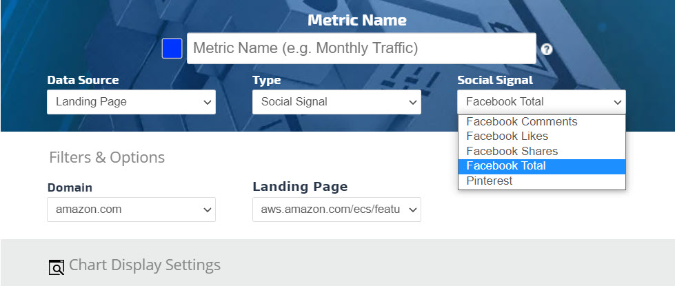
Landing Page Social Signals Insight Graph
Landing Page Social Signals
Select any of the following Social Signals
Facebook Clicks
Facebook Comments
Facebook Likes
Facebook Shares
Facebook Total
Pinterest
Metric Name
Enter the name that you want to be displayed as the legend label
Filters & Options
Refine the data you want to be displayed in the Insight Graph by selecting a Domain and Landing Page filter.
Deprecated:
The following landing page metrics have been deprecated because they are no longer available via the data provider's API
Majestic and Moz (December 2016)
Google+ (September 2017)
Add to PDF Report
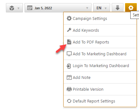
Conveniently add a report or graph with its current settings to a PDF report by hovering over the gold gear icon and selecting Add to PDF Reports
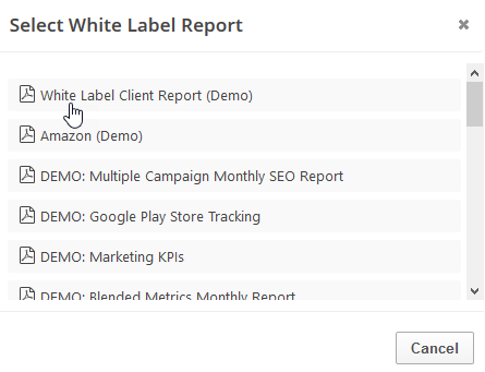
Select the PDF Report that you want the report or graph added to
Drag the new report or graph into the position you want it to display in the PDF and confirm that the Date settings do not conflict with the automated scheduling settings.
PDF Report Settings - Insight Graph
Reports and graphs can be added to automated PDF reports via the report screen (as described above) or manually in the PDF Report Content screen. If the report is added via the:
report screen, then begin by clicking the Edit button corresponding to the report
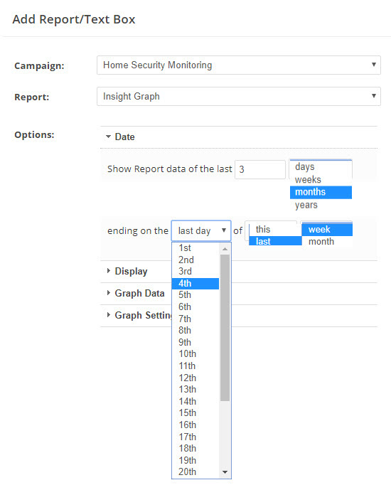
PDF Report Content screen, then click the Add Report button and select the Campaign name and Report: Insight Graph.
Date
Expand the Date Options section and in the Show Report date of the last field type in the number of periods to be displayed in the report
In the next field select one of the following options:
days
weeks
months
years
In the data ending on field select one of the following options:
first day
last day
or a specific day of the month
or a specific day of the week (when weekly reports are selected)
In the of field select one of the following options:
this
last
In the next field select one of the following options:
week
month
The selection must produce a logical date setting based on the PDF report's automated scheduling (at the bottom of the Report Details screen). For example:
last day of last month
1st of this month
last day of last week
If the report is scheduled to be sent every Monday, then the following example would be invalid:
Saturday of this week (because weeks begin on Sunday and if reports are sent on Monday, then Saturday of this week hasn't yet occurred).
If the report is scheduled to be sent on the 1st day of every month, the following example would be invalid:
last day of this month (because it's only the 1st day of the month the report is being sent)
Display
Custom Report Title (optional): Displays across the top of the report section.
Data Source (optional): Display Data SourceIcon(s) by moving the slider to the right.
Select the Data Source from the menu. (only available if the Data Source Icon(s) is toggled on).
General
Display the Google Algorithm Updates indicator (displays on graph as a red bar and can be moused-over for details) by moving the slider to the right.
Notes
Display Notes by moving the slider to the right.
Graph Data
Click the Add Metric or Cross Campaign Metric (available in Enterprise packages) button to add a new metric to the graph. Repeat to add multiple metrics.
Graph Settings
Display the Graph Legend by moving the slider to the right.
Enter the Graph Width (in pixels) and Height (in pixels) or keep the default setting.
Select Combined or Single Metric Hover; Combined displays data of all graph metrics for the point on the graph that you hover over, and Single displays only hover point data for the single metric.
Select Axis Title Size by moving the slider until the preferred font size number is displayed.
Select Bold or Normal from the menu for Axis Title Weight.
Add to Marketing Dashboard
Conveniently add a report or graph with its current settings to a marketing dashboard:
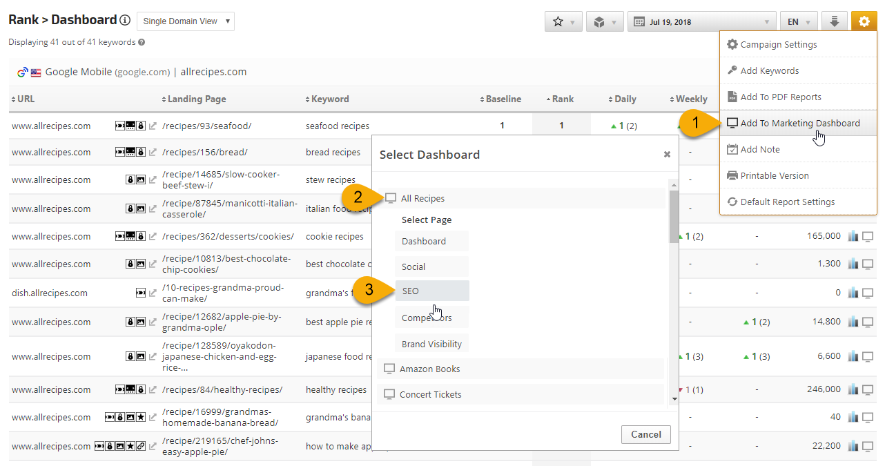
1. Hover over the gold gear icon and select Add to Marketing Dashboard
2. Select the Dashboard (campaign name)
3. Select the Dashboard Page that you want the report added to
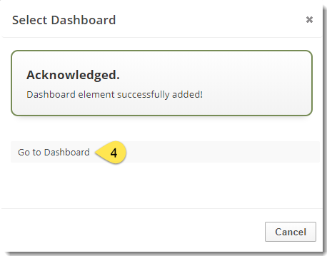
4. Click the "Go to Dashboard" link to further customize the report (e.g., drag it to a specific position on the page, change date settings, etc.)
Refer to the Report Options section for details regarding the display settings, filters and sort options available for this report.
The report date (or date range) is governed by the selected Dashboard date option: Date Selection or Fixed Periods, learn more...
Daily reports default to the last day of the selected period
Weekly and monthly reports default to 1 month of data
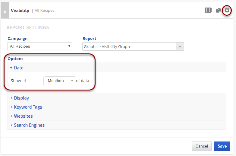
To change the number of weeks or months displayed in a specific report, click the gear icon for any marketing dashboard report element and expand the Date option section, enter the number and click the Save Button.
Add to Client Dashboard
Customize Report for Client Dashboard
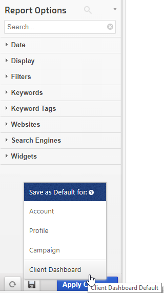
Client Dashboards display our default report options for each individual report and graph until you modify them. To customize the display of the report, expand the Report Options section, change the settings and click the Apply Changes button.
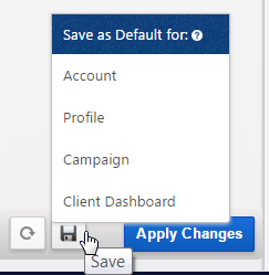
Then expand Report Options again and hover over the Save icon and select Save as Default for Client Dashboard.
After saving the Client Dashboard default, any changes that you make to the report options will not affect the display in the Client Dashboard unless you overwrite it by following these instructions again.
Enable the Report or Graph to display in the Client Dashboard
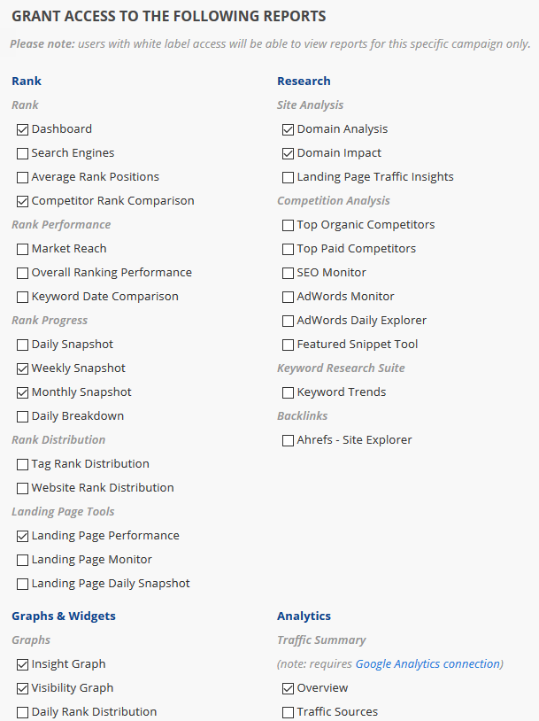
Open the Campaign Settings > Client Dashboard screen and check the box corresponding to the report(s) you want displayed in the dashboard, and then click the Save button.
Refer to Client Dashboard Settings documentation for additional instructions for customizing your dashboard.
Rank Position Stats Insight Graph
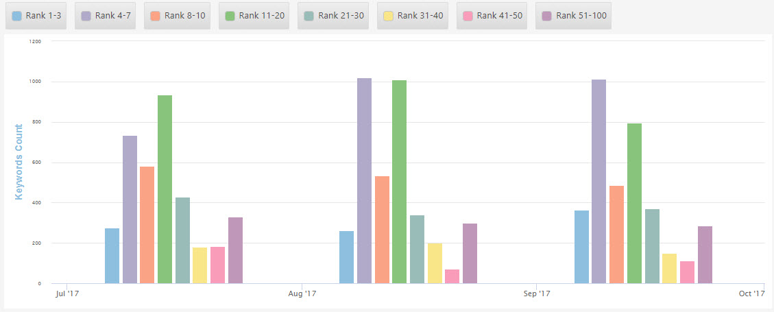
If you want to share rank position statistics in a colorful way in dashboards and PDF reports, you can create a custom Insight Graph using the Rank > Rank Position Stats metric. In this example, rank position trend for one website is demonstrated.
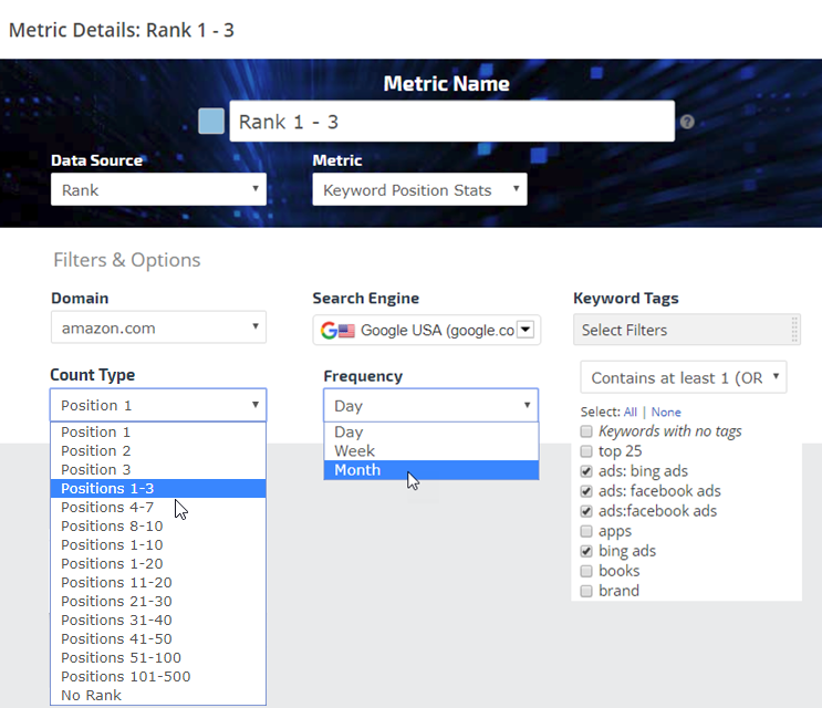
In an Insight Graph, add a Metric and name it, then select:
Data Source: Rank
Metric: Keyword Position Stats
Domain: select a website
Search Engine: select a search engine
Keyword Tags: select tags to filter the report data (optional)
Count Type: select from the list of available rank positions
Frequency: select Daily, Weekly, or Monthly
Color Palette
Click the color block that displays to the left of the metric name you entered and select the color that you want displayed in the graph
Chart Display Settings
Select a Chart Type. If you want a graph similar to the example above, then select Chart Type: Column.
Show or hide Markers (shapes, usually used for line charts) and Labels (the metric numbers), and if shown, then select the size and type.
Top 10 Competitor Rankings Graph
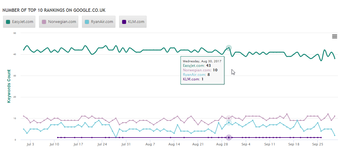
Utilizing the Line chart type, this Insight Graph displays the number of top 10 rankings for a site and its competitors, trending over a 3 month period. Hovering over any point on the graph reveals the number of top 10 positions for the site vs. the competitor sites.
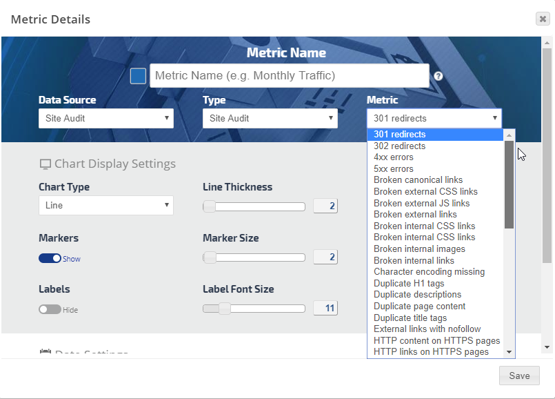
In the Metric menu select one of the available Site Audit metrics
Add the Metric Name, select a color and the chart display settings you want and click the Save button
Repeat for additional metrics.
Site Audit Insight Graph example
Social Analytics Insight Graph
Social Metrics Options
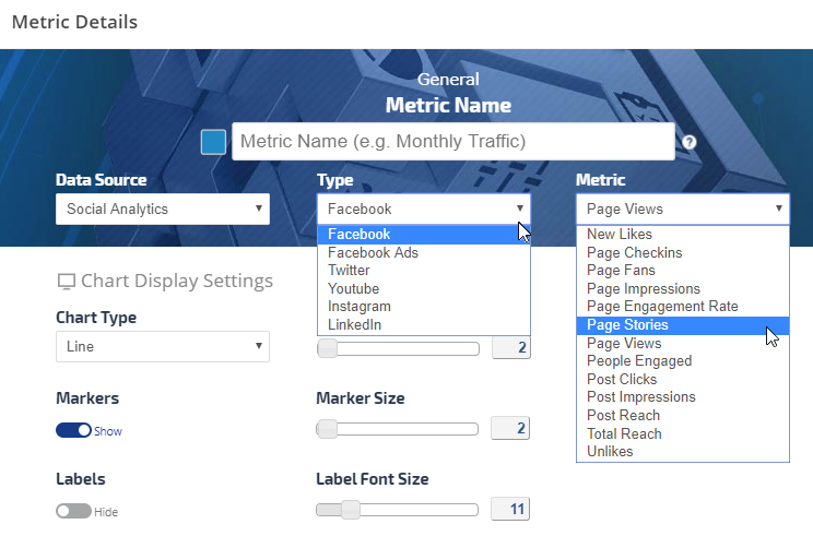
After connecting a company's Social Analytics accounts to Rank Ranger, in addition to viewing detailed social marketing reports you can add their metrics to an Insight Graph for trending and comparison between Facebook, LinkedIn, Twitter, YouTube & Instagram.
Facebook Metrics
New Likes
Page Checkins
Page Fans
Page Impressions
Page Stories
Page Views
People Engaged
Post Clicks
Post Impressions
Post Reach
Total Reach
Unlikes
LinkedIn Metrics
Total Followers Gain
Organic Followers Gain
Acquired Followers Gain
Reach
Twitter Metrics
Followers (Lifetime)
Following (Lifetime)
Favorites (Lifetime)
Tweets (Lifetime)
Lists (Lifetime)
Tweets
Retweets
Replies
Favorites Gained
Retweets Gained
Mentions
Mentions Reach
Mentions Replies
Mention Replies Reach
Mention Retweets
Mention Favorites
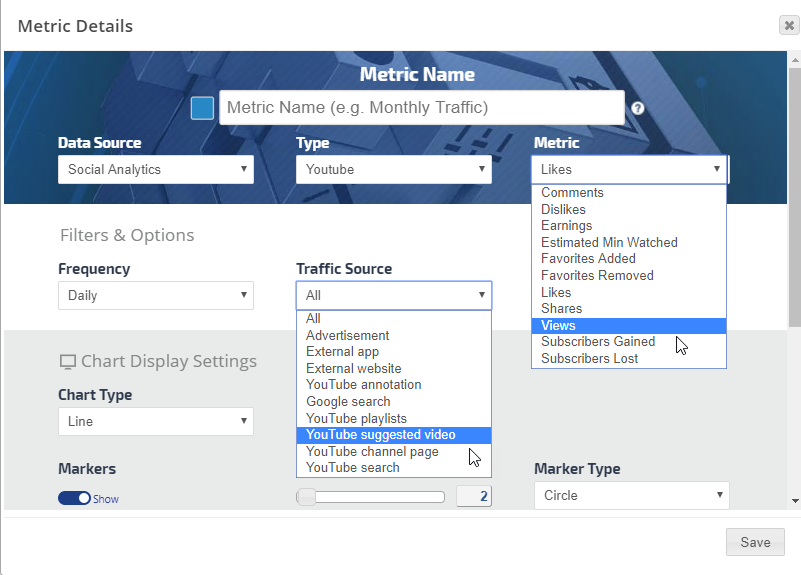
YouTube Metrics
Comments
Dislikes
Earnings
Estimated Minutes Watched
Favorites Added
Favorites Removed
Likes
Shares
Views
Subscribers Gained
Subscribers Lost
Instagram Metrics
Followers
Following
Total Posts
Metric Name
Enter the name that you want displayed as the legend label